“Working with Red Kite was an absolute pleasure from start to finish! The team were professional, approachable and incredibly detail-oriented.”
Alex Sordillo
Founder & Educator
Project overview
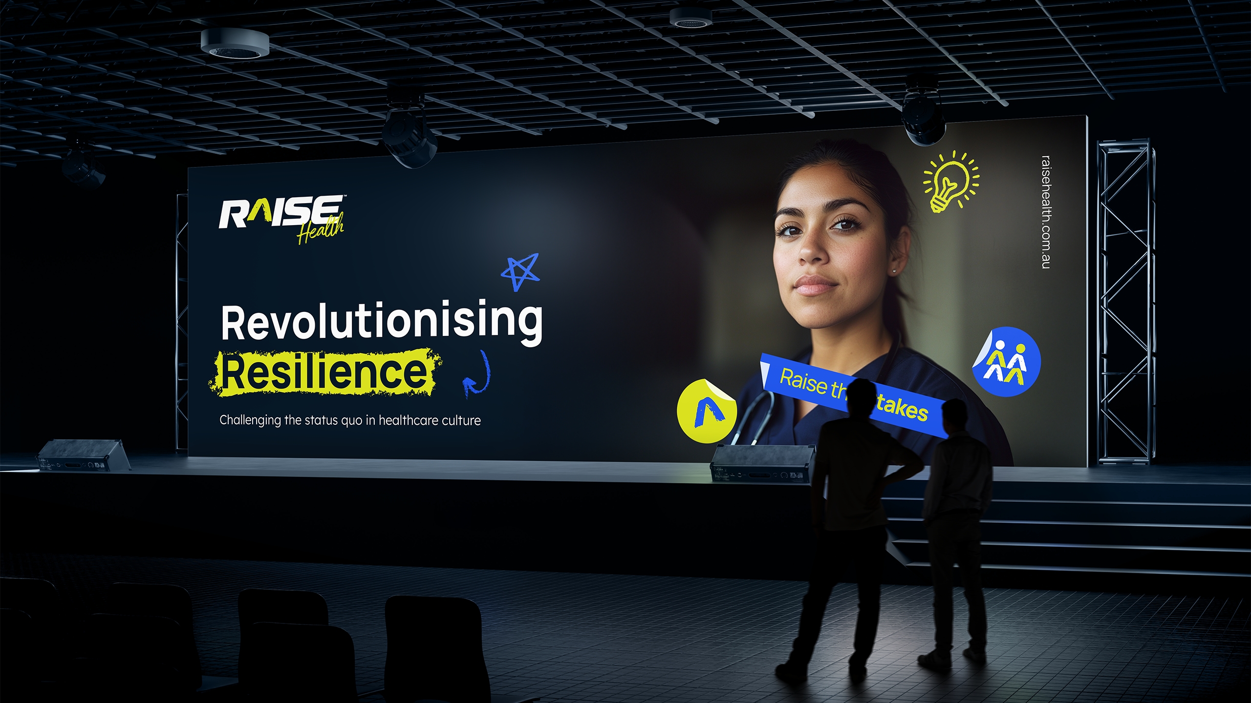
Building a brand that challenges the norm in healthcare training
Raise isn’t your typical training provider—it’s a brand built by healthcare workers, for healthcare workers. They came to us with a vision to shake up the status quo and push back against the stiff, corporate-style training that doesn’t speak to the real challenges of the job. Our goal was to create a brand that felt raw, relatable, and just the right amount of rebellious—something that truly reflects the lived experience of the people it’s made for, and sparks real change from the inside out.
Unpacking the pressure, purpose, and potential behind Raise
Before any sketching or moodboarding, we sat down with Raise for a deep-dive Brand Intensive—a candid, big-picture conversation to get to the heart of the business. What we uncovered was crystal clear: this wasn’t just another training company. It was a mission-driven brand, created by someone who’d lived the frontline experience, and who saw the cracks in the system. Raise wanted to challenge traditional, top-down training models and offer something real—training that was grounded in lived experience, spoke human-to-human, and gave healthcare professionals the tools to look after themselves and each other. That clarity gave us the direction we needed to build a brand with purpose, edge, and heart.
What we covered
Origin story
Products & services
Competitive landscape
Target audience
USPs
Marketing strategy
Future aspirations
Brand personality
Design requirements
& more
The logo: the first piece of the puzzle
Simple on the surface, loaded with meaning
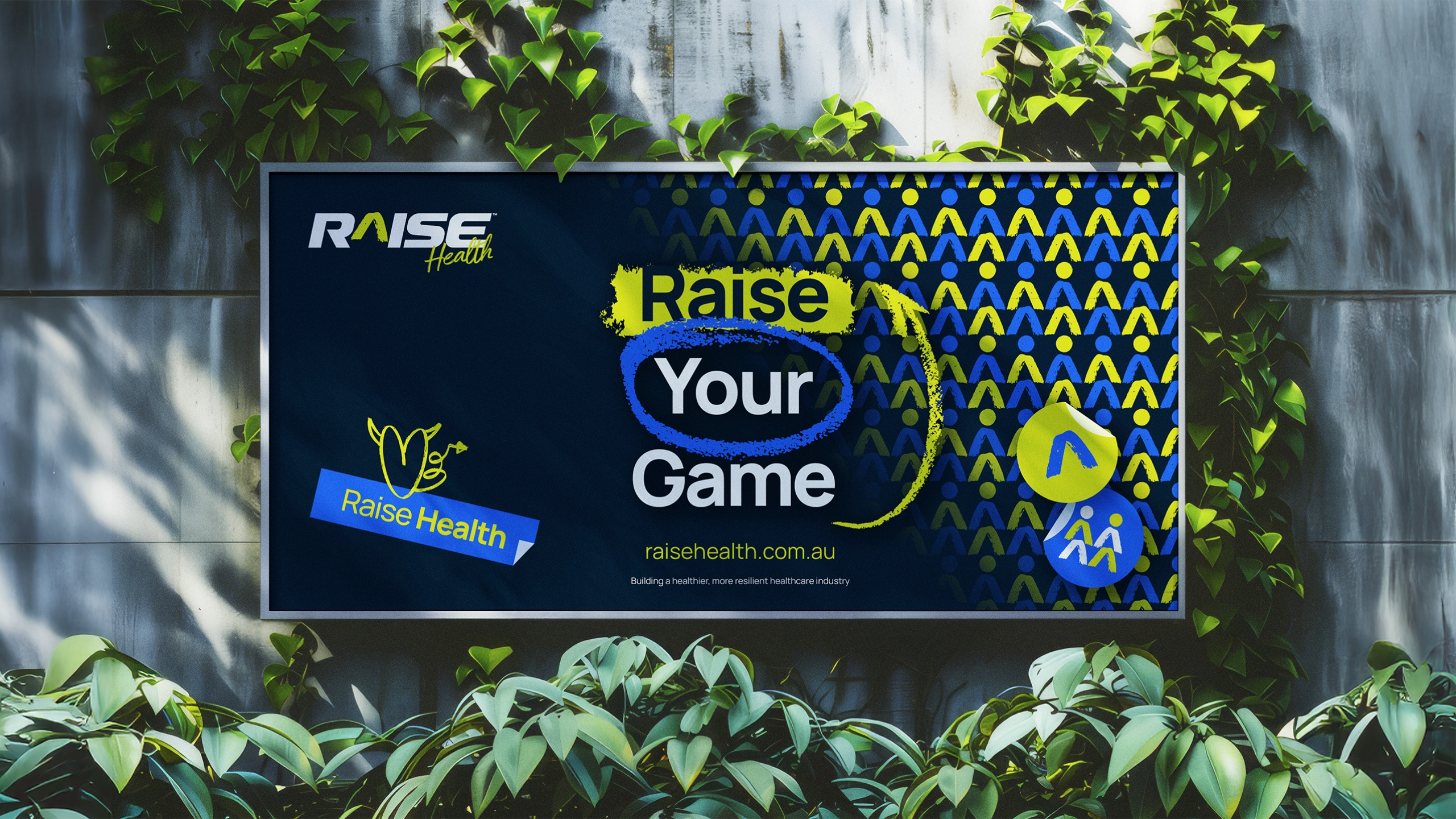
Raise’s logo needed to be more than just good-looking—it had to carry weight. The bold, all-caps wordmark speaks to strength and confidence, with custom letterforms that bring a modern, energetic feel. We swapped the ‘A’ for a caret symbol (^)—a subtle nod to growth and elevation, and a smart tie-in to the brand name. The sporty edge hints at Raise’s roots in high-performance psychology, while the clean, professional finish keeps it grounded in the healthcare space. It was the perfect starting point for a brand that’s here to raise the standard.
Building the brand beyond the logo
The brand assets that make it unmistakably Raise
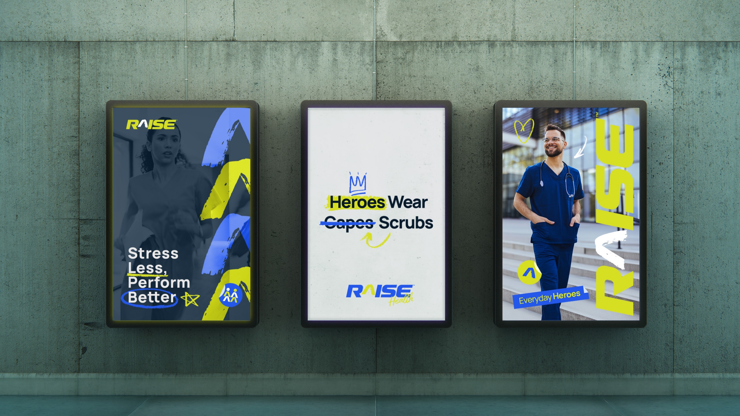
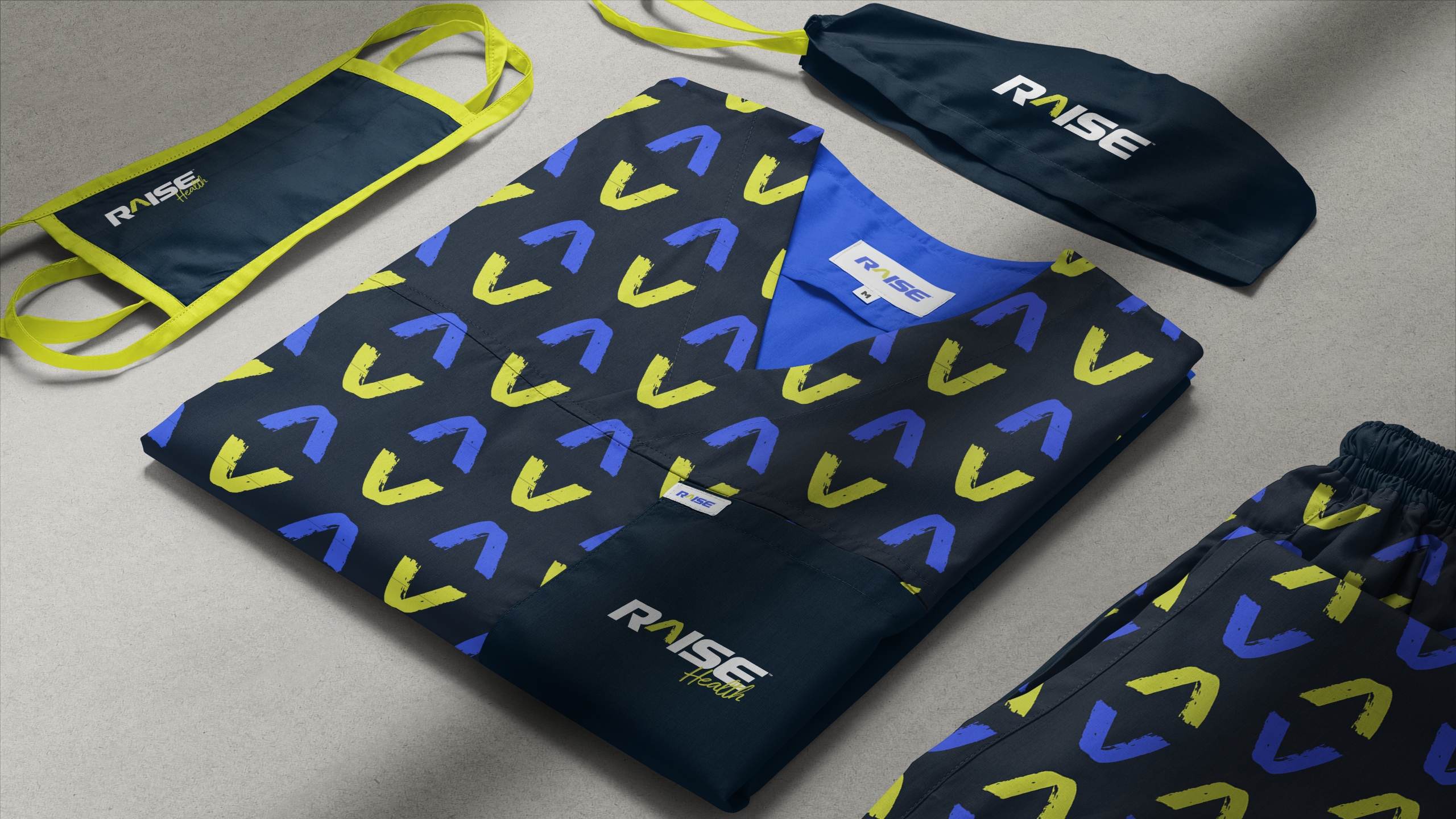
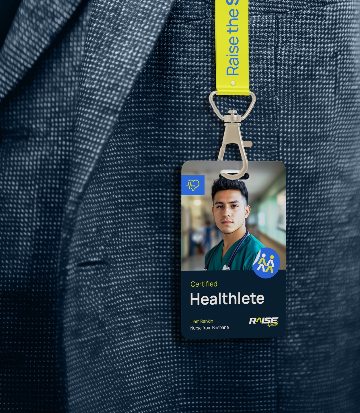
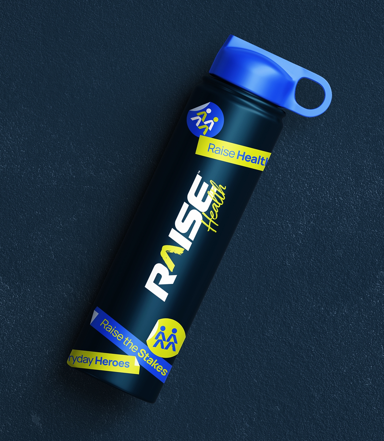
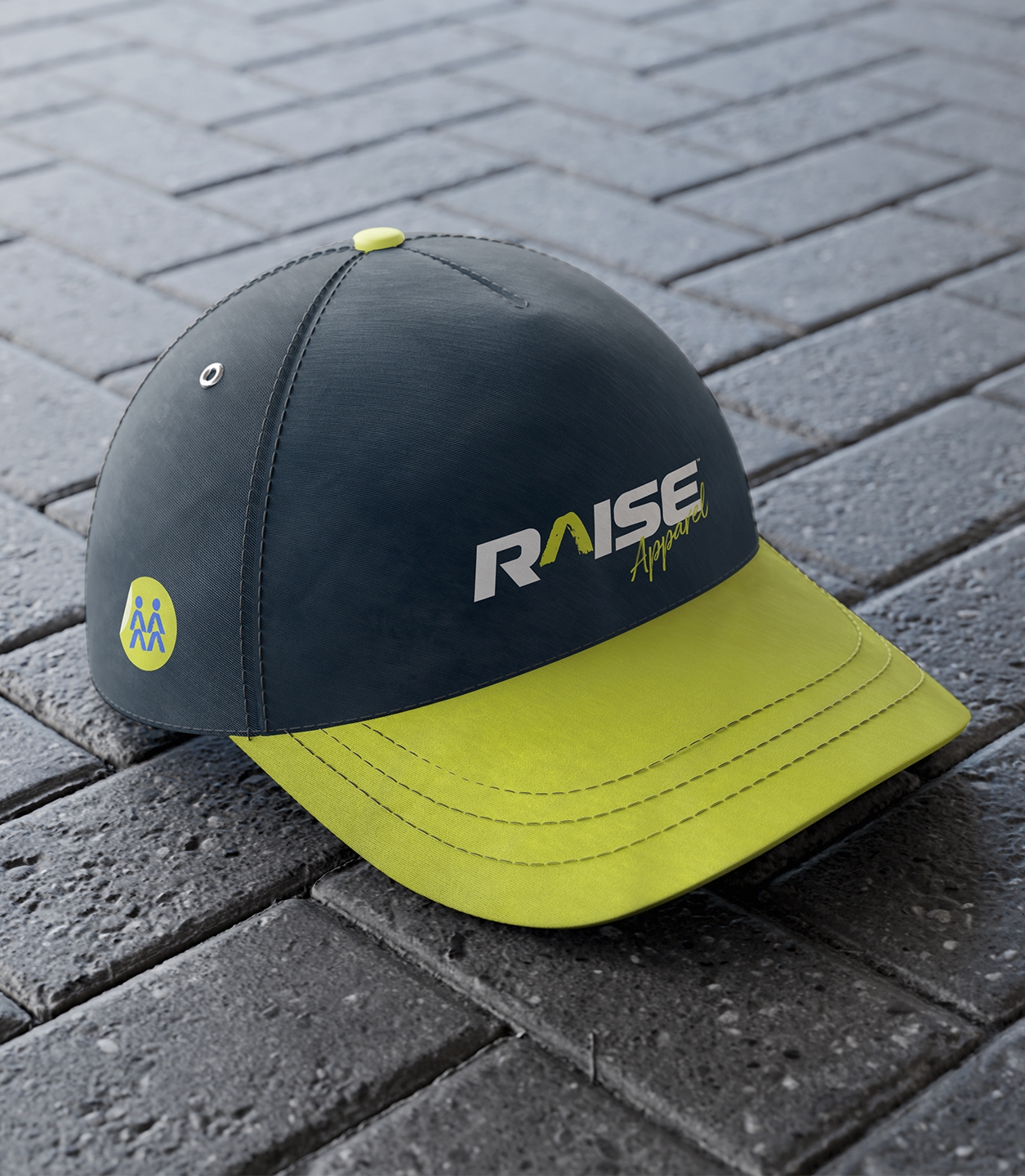
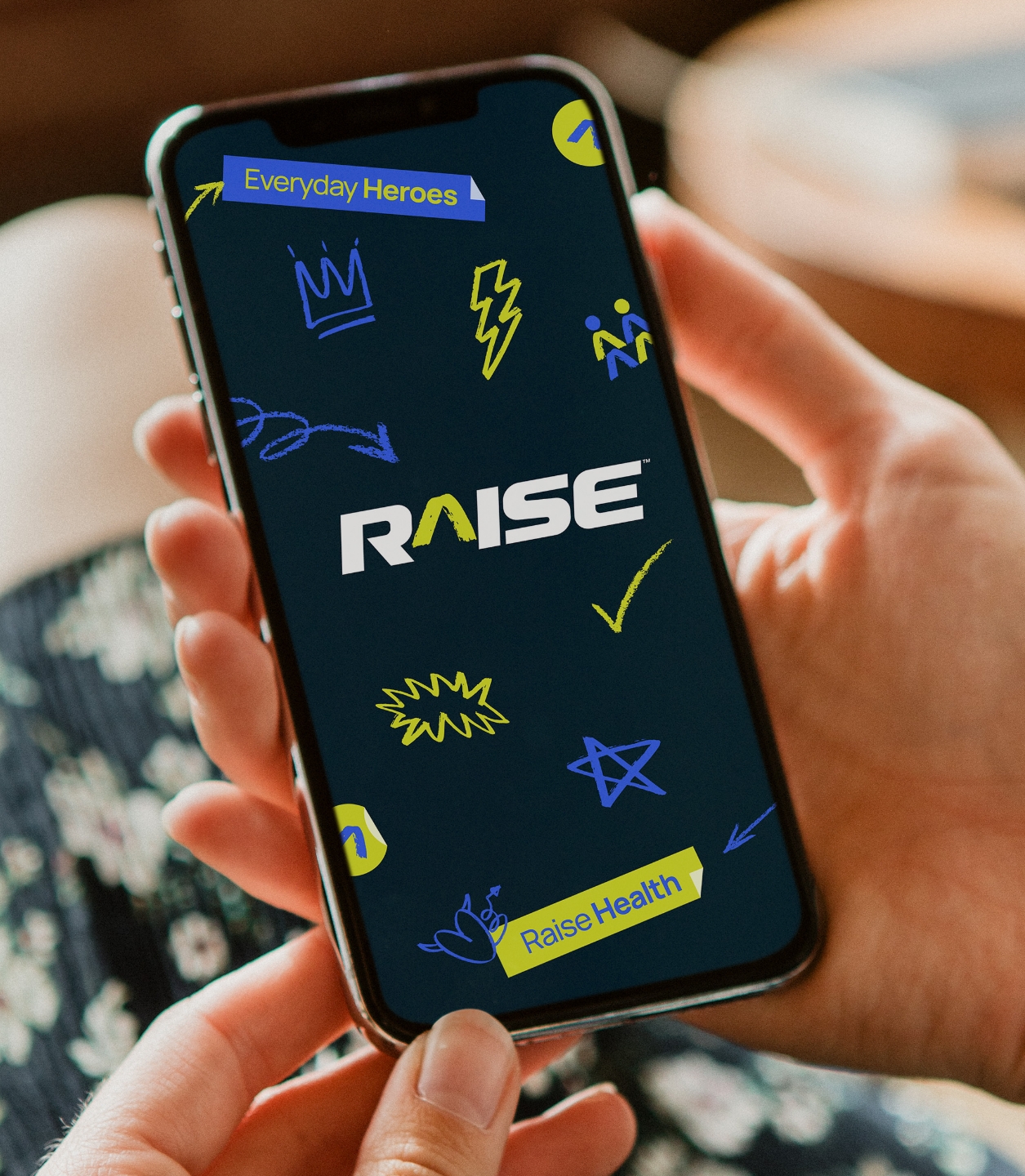
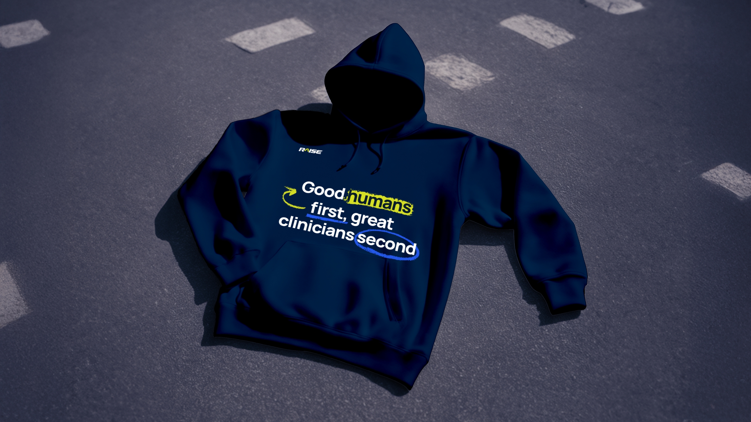
A logo’s just the start. To make Raise truly stand out, we built a full identity system that captured their bold, human-first personality—and made sure it worked just as well in a hospital corridor as it did in a keynote presentation. From rebellious hand-drawn icons to expressive stickers and caret-based patterns, every element was designed to be energetic, relatable, and unmistakably Raise. These assets don’t just decorate—they help the brand connect with its audience, feel real in high-pressure environments, and carry a sense of movement and momentum across every touchpoint. It’s the kind of branding that sticks—not just visually, but emotionally.
Brand assets created
Sub-brand logo suite
Bespoke iconography
Playful sticker set
Hand-drawn accents
Custom ‘caret’ graphics
Brand patterns
Typography treatments
Image editing
Distinctive & versatile brand elements
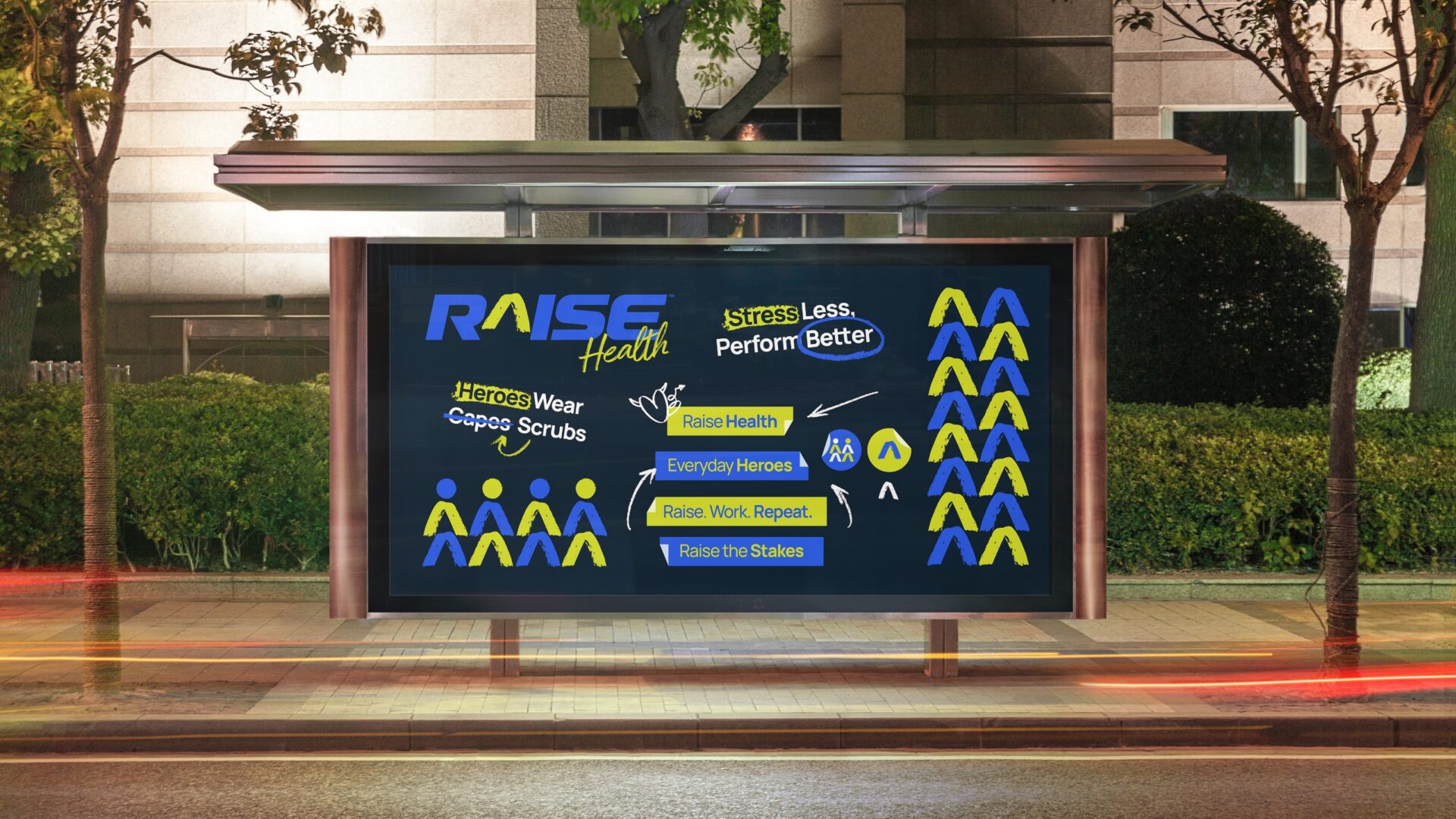
Messaging that’s unmistakably Raise
A voice that empowers & inspires those who show up for others
With a brand this mission-led, the words had to work just as hard as the visuals. We developed a messaging system that captured Raise’s rebellious spirit, empathetic heart, and deep healthcare know-how—helping them speak directly to the people who matter most. From their positioning statement and tagline to a clear tone of voice and language guidelines, every piece was designed to challenge the status quo while staying grounded in lived experience. The result? Messaging that feels like it’s written by a peer, not a corporate script—and speaks to healthcare professionals with the clarity, honesty and courage they deserve.
What was included
Brand story
Purpose, vision & mission
Values
Archetype & personality
Voice
Attributes
Vocab
Key messages
Difference
Positioning
Taglines & slogans
& more
Comprehensive brand guidelines
Rolling it out to the real world
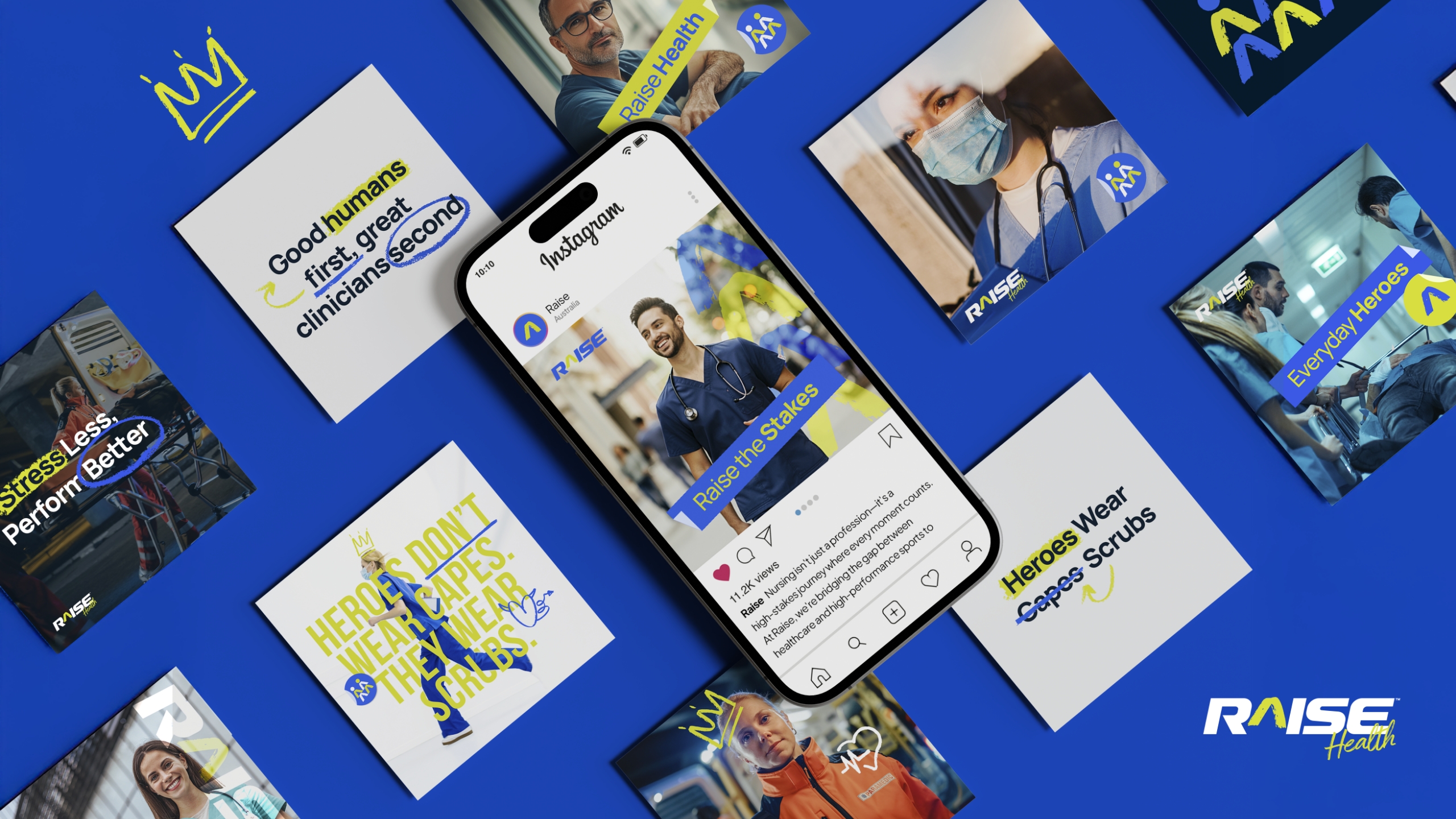
From the ward to the website—Raise shows up loud & proud
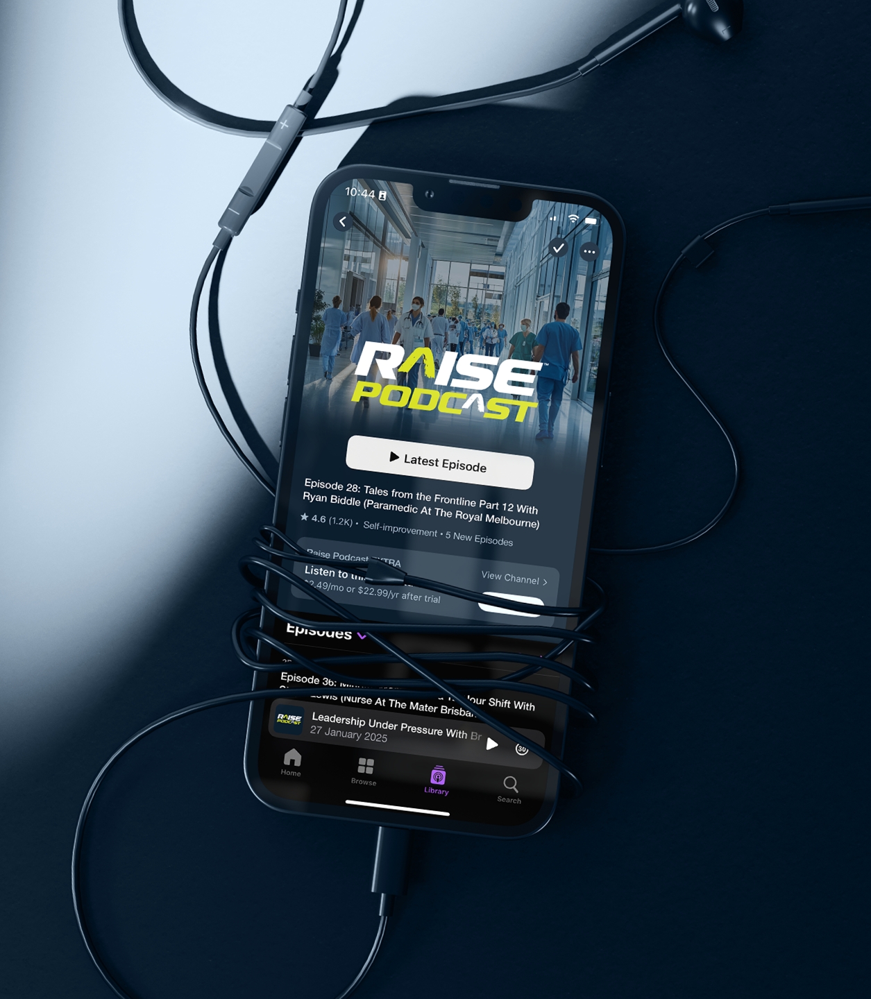
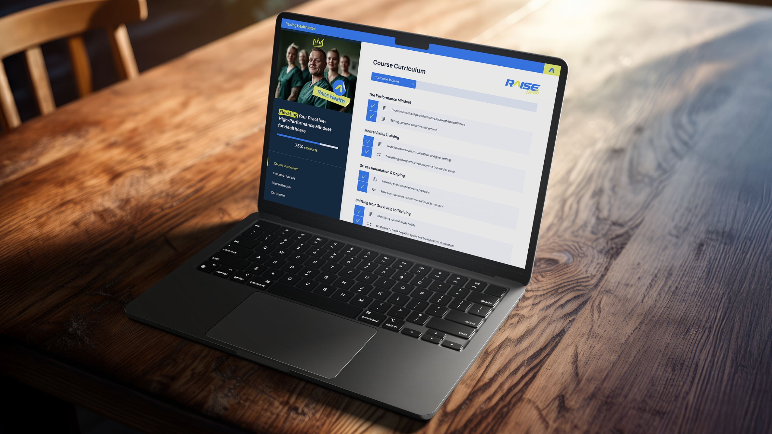
With the logo, assets & messaging locked in, it was time to let the brand stretch its legs. Raise needed a full suite of collateral—social posts, merch, templates, documents, and digital content—that could carry its bold personality and stay recognisable everywhere it showed up. From real-world essentials like stationery and presentation decks to high-impact moments like speaking events, podcasts, and branded scrubs, we built everything to feel distinctly Raise. Now, whether it’s a coaching slide or custom scrubs, the brand always shows up with confidence, consistency, and a whole lot of heart.
Brand collateral crafted
Social media kit
Social media post templates
Stationery
Email signatures
Merchandise
Pitch deck templates
Comprehensive brand guidelines
& more
Social post templates, Canva ready!
A brand that moves like it means it
Putting character in the caret
As the final piece of the brand puzzle, we created a logo animation that adds extra punch to Raise’s digital presence. The animation transforms the caret symbol into a playful character, tying together the brand’s visual assets with personality and purpose. It’s short, sharp, and full of energy—perfect for intros on social media, videos, and the website. More than just a logo reveal, it’s a dynamic expression of what Raise stands for: progress, people, and a little rebellion in all the right places.
“Working with Red Kite was an absolute pleasure from start to finish! The team were professional, approachable and incredibly detail-oriented. Chris took the time to really understand the concept of the business and the team were given the creative freedom to explore design space for the brand – and in doing so nailed the visual and verbal identity for it.
Their creative expertise, collaborative style and excellent communication delivered an outstanding final product! I can’t recommend RedKite highly enough, huge thanks to Chris, Ally and the rest of the team!”

 Raise Health