“The team really listened to what I wanted throughout the whole process and nailed the brief in their 1st attempt.”
Billy Schiller
Managing Director
Project overview
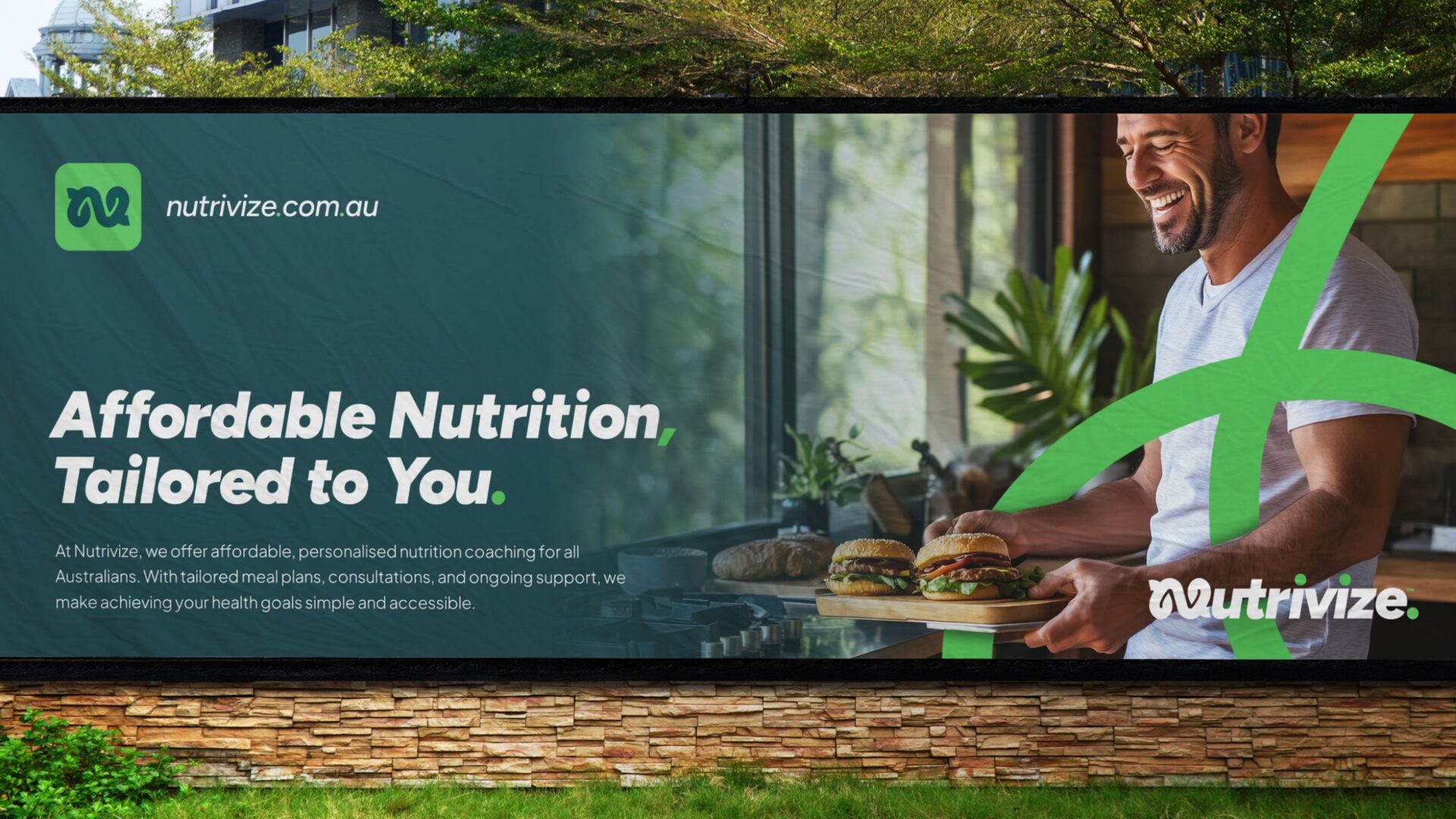
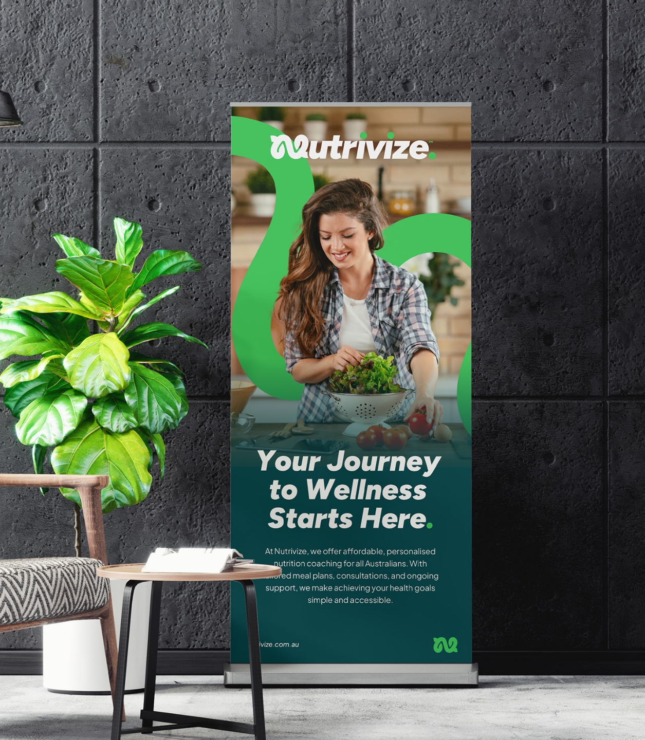
Branding the next generation of nutrition coaching
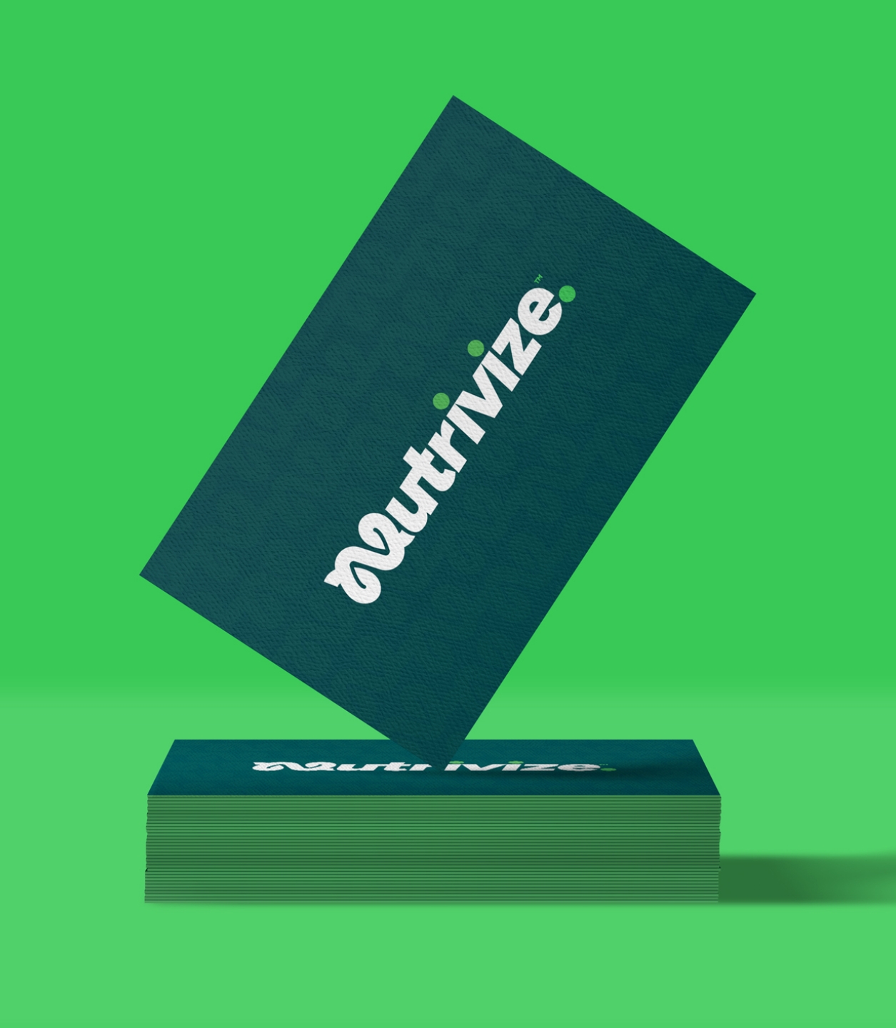
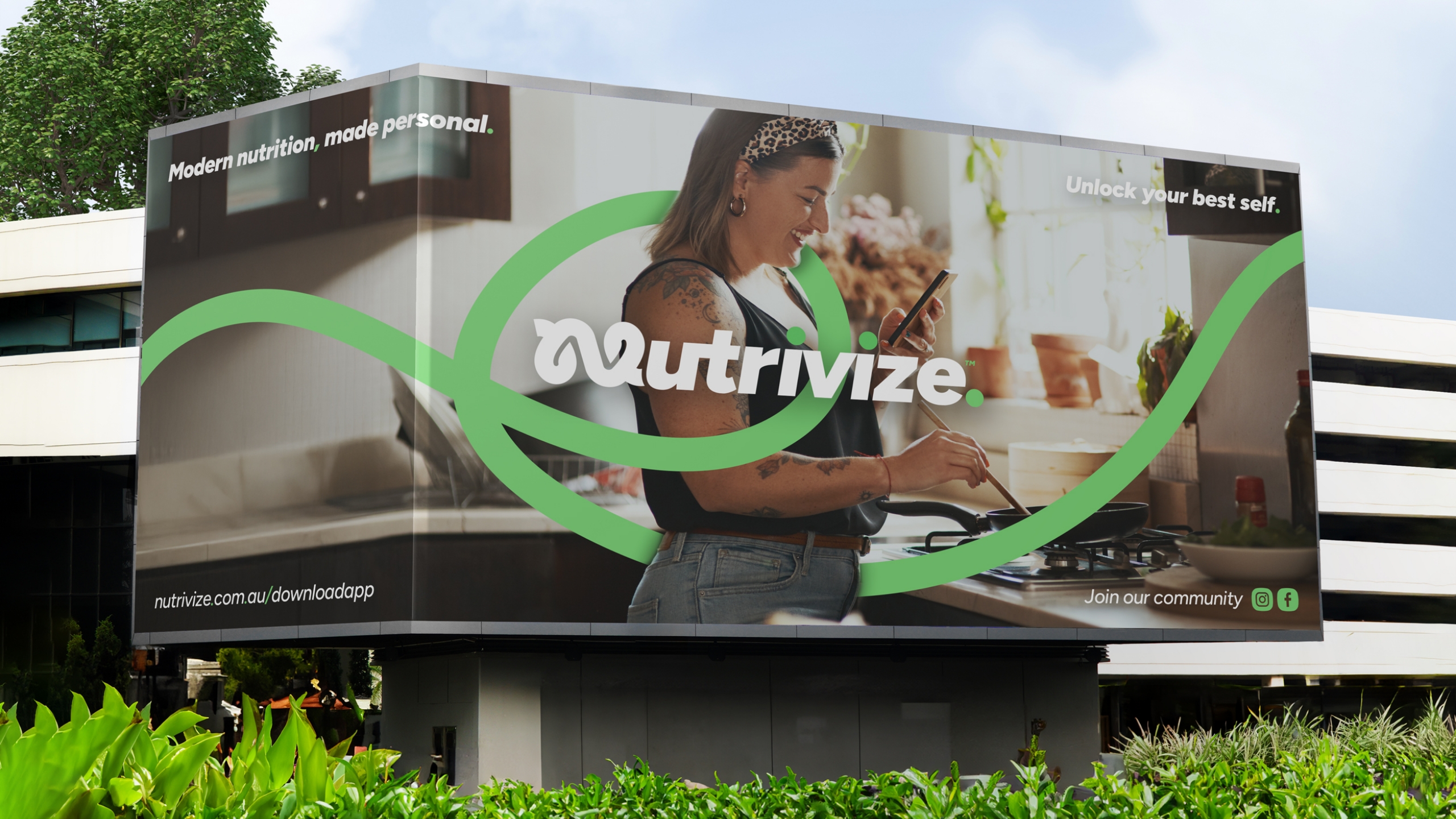
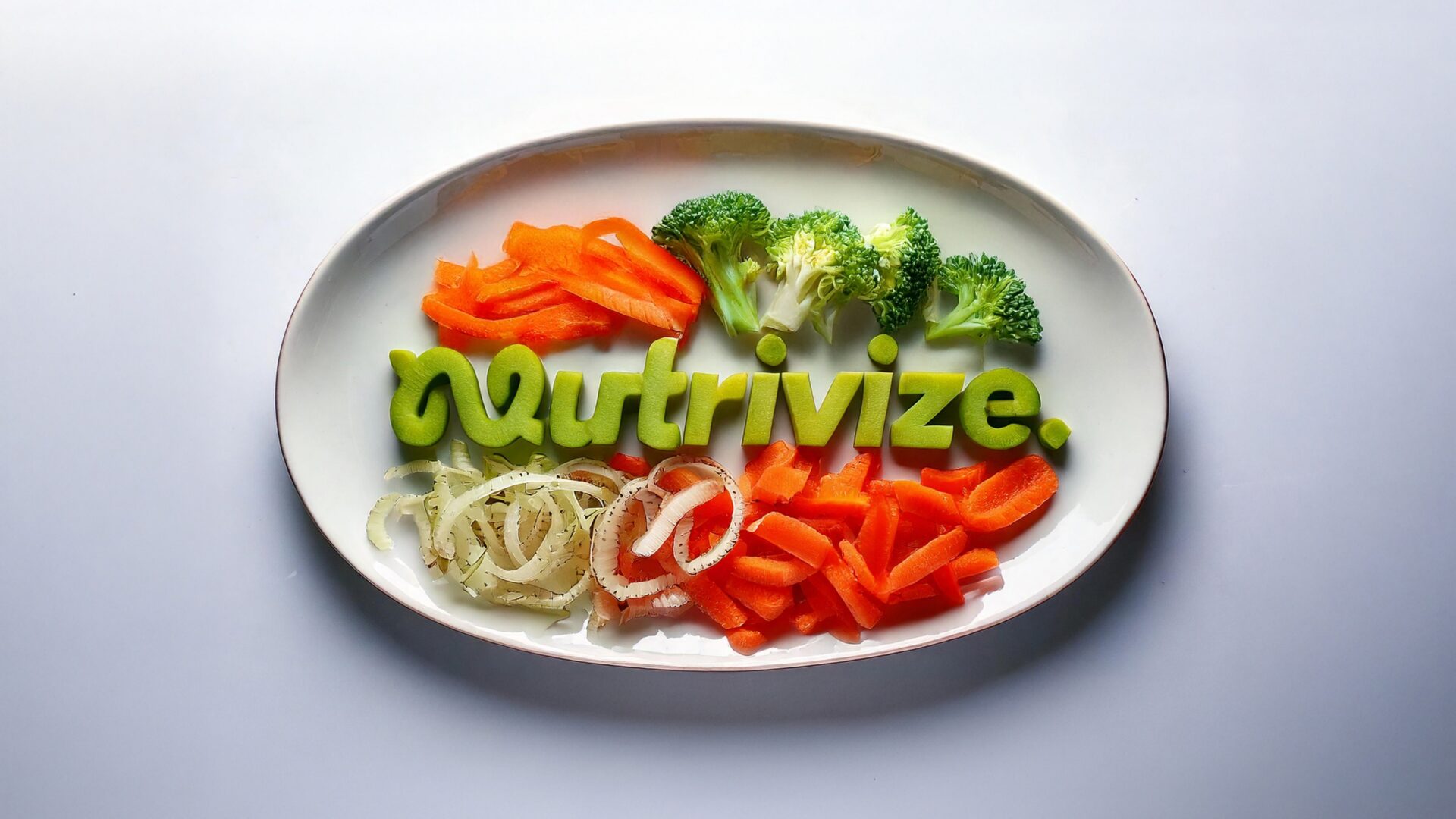
Nutrivize isn’t just another meal plan provider. With personalised memberships and plans for a future-facing app in the works, it’s setting a new standard for affordable, accessible nutrition coaching. We teamed up to build a full brand identity that’s fresh, credible, and totally distinctive—balancing a premium feel with approachability. From the bold ‘N’ logo to versatile visual assets, we laid the groundwork for Nutrivize to grow with confidence.
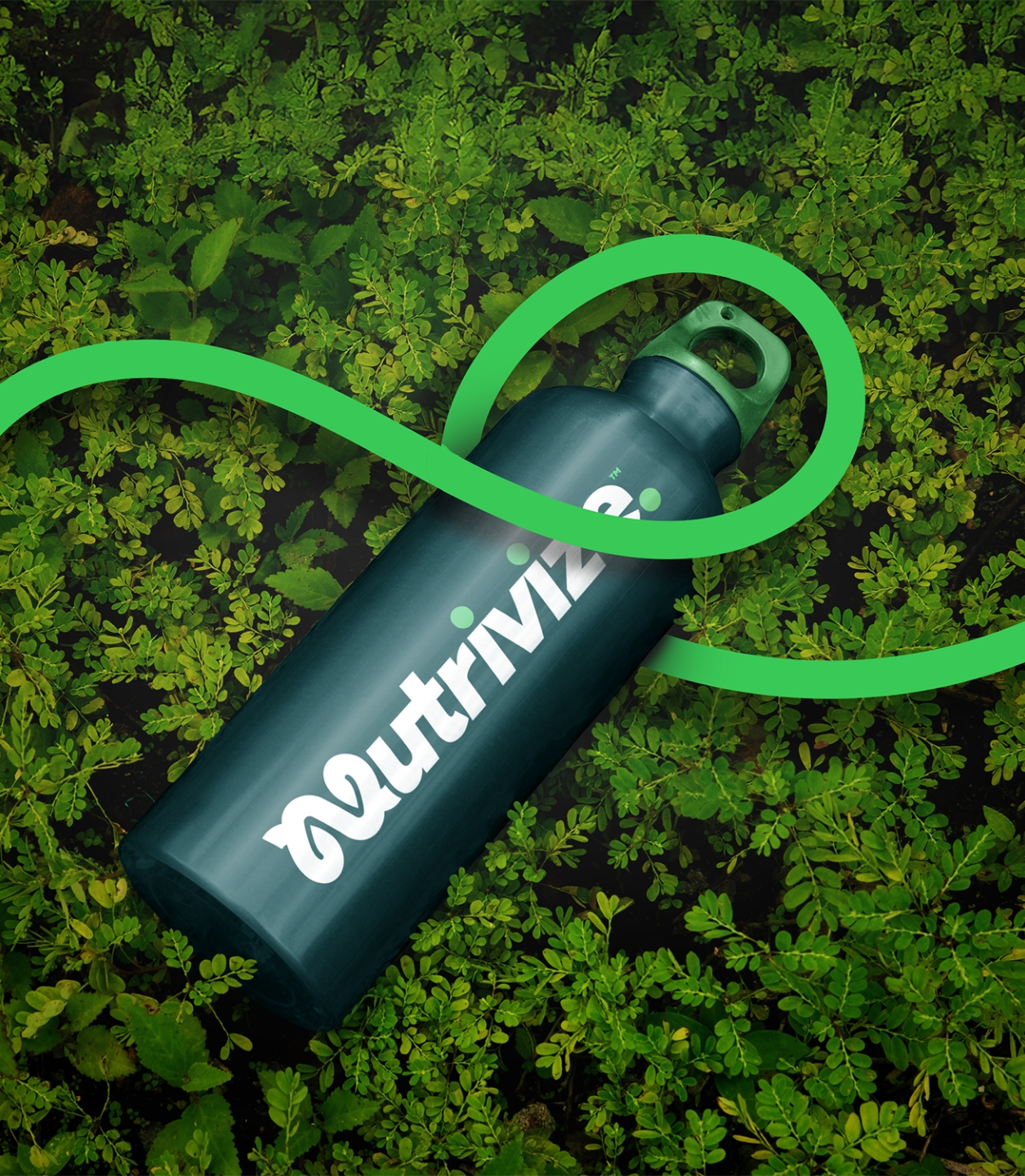
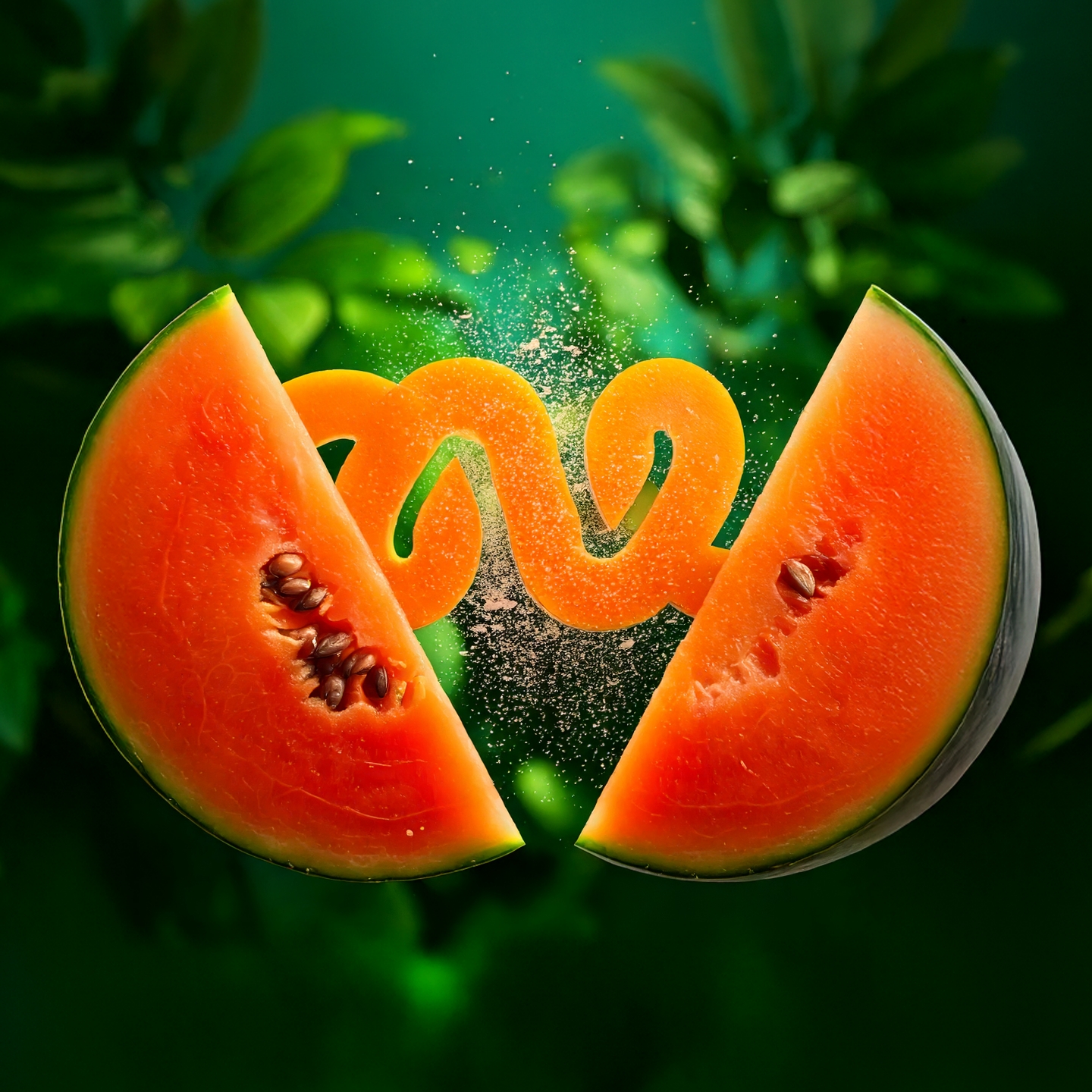
We created a unique ‘N’ symbol that does more than look good. Inspired by abstract leaf shapes, the human gut, and an infinity loop, it captures Nutrivize’s commitment to holistic, long-term health.
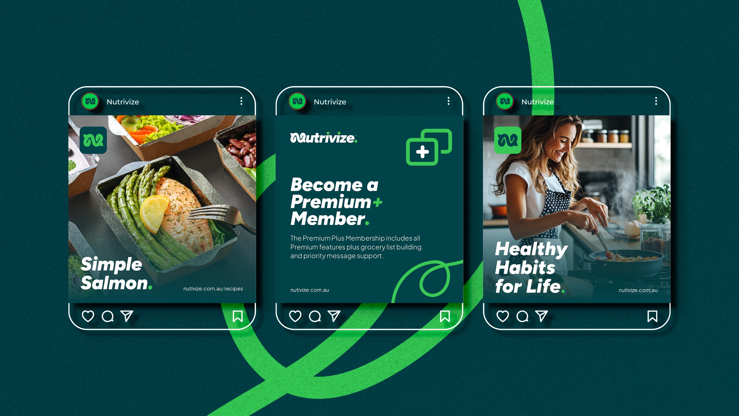
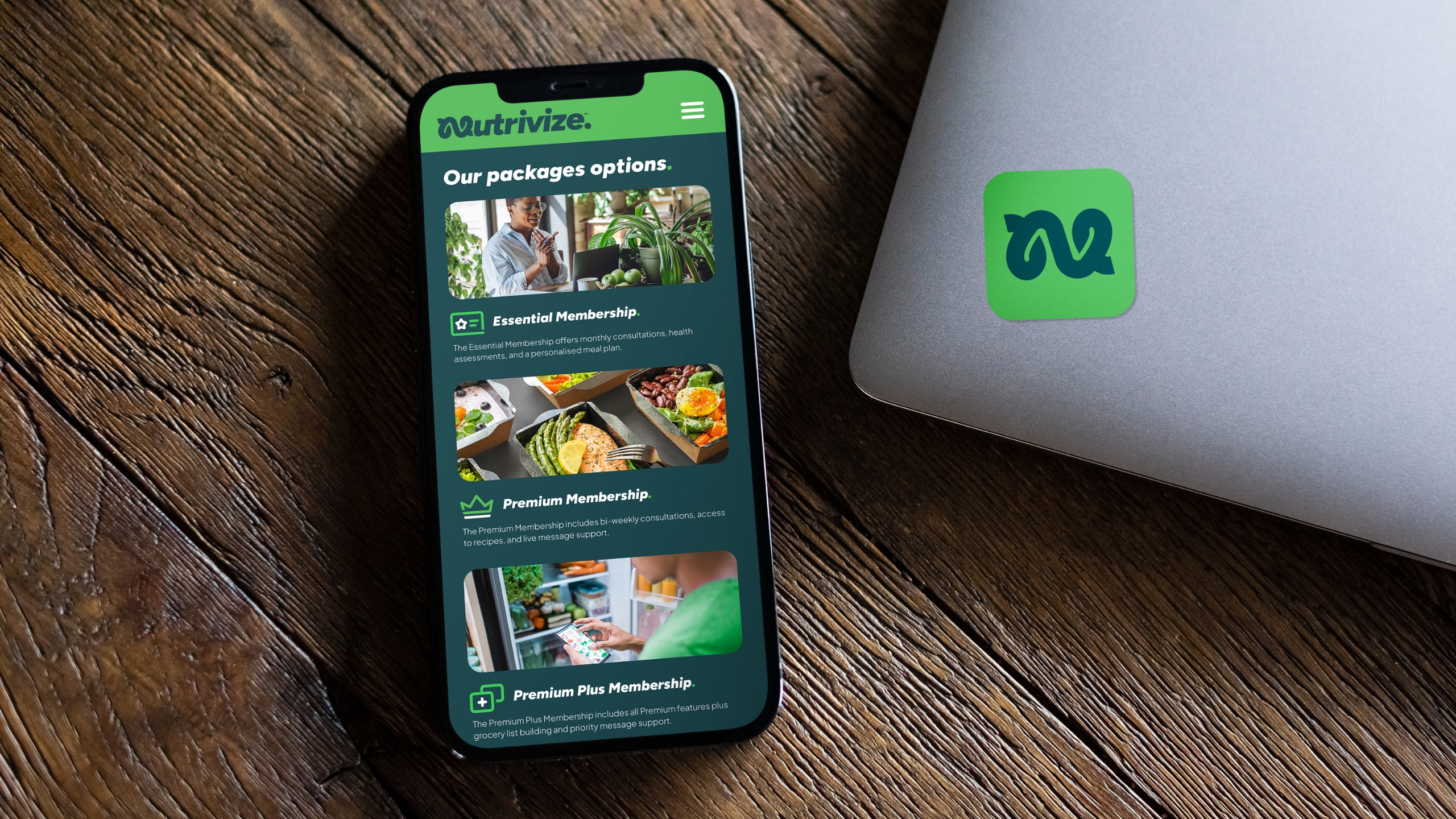
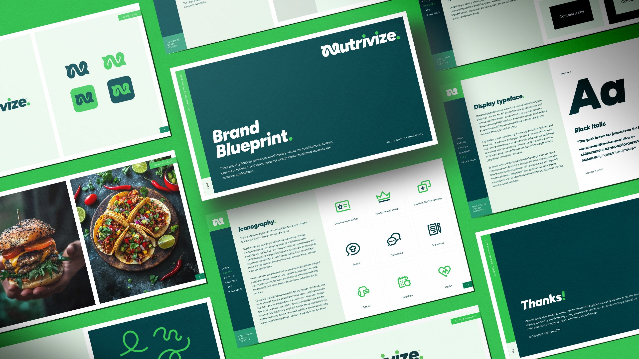
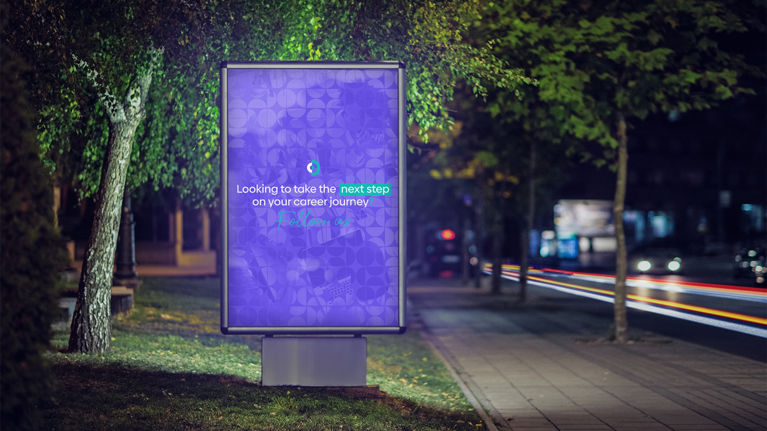
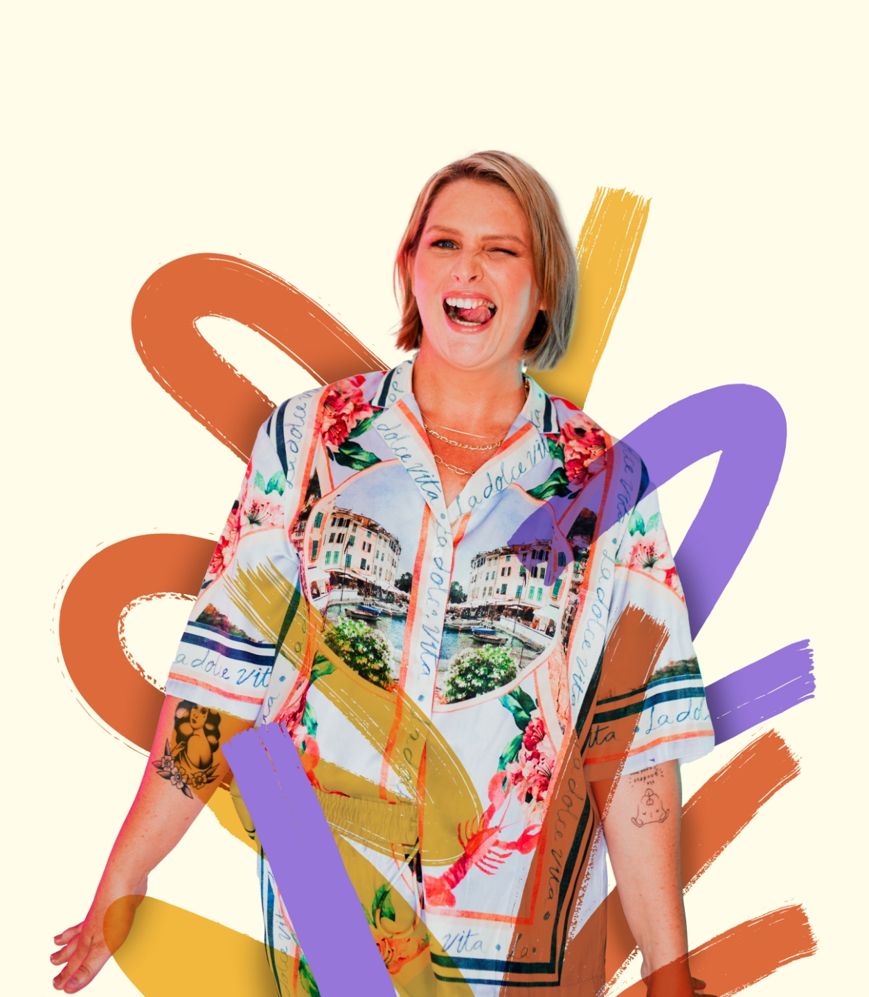
Visual assets with real personality
From icons to flowing shapes and patterns, we crafted a visual system that works now—and scales later. Every asset is designed to adapt across future platforms, products, or content.
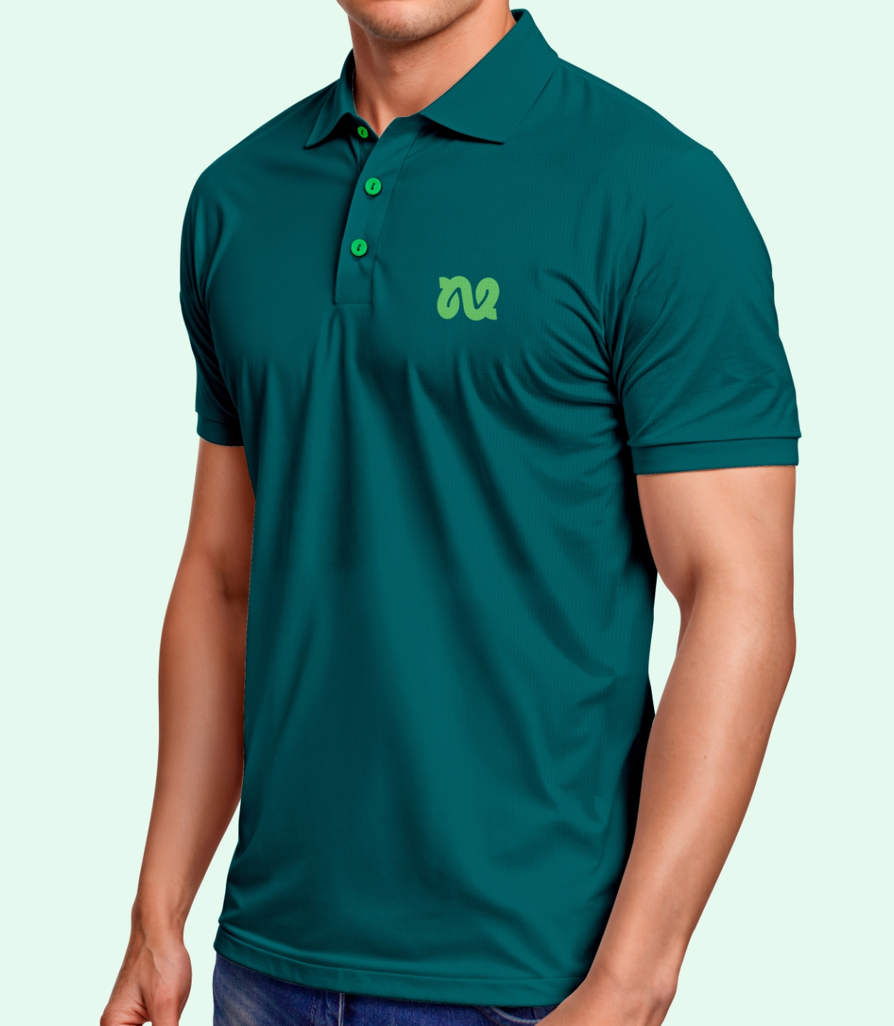
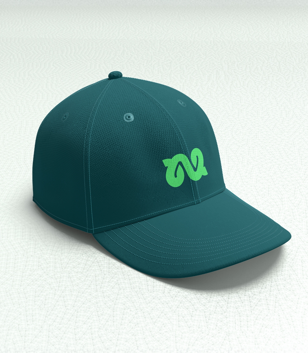
A toolkit built to flex and grow
From social media kits to stationery, we rolled out the brand across key touchpoints—keeping everything on-theme, on-brand, and ready to go.
Locked, loaded, and looking the part
The branding gave Nutrivize instant credibility and clarity—arming them with the tools to launch with clarity and confidence. Nutrivize now has a strong, consistent identity they can build on across every channel.
Website graphics for ecom store
The brand’s playbook
“Chris and the team were fantastic to work with! The team really listened to what I wanted throughout the whole process and nailed the brief in their 1st attempt. They were able to bring my vision to life and exceed my expectations, I highly recommend using Red Kite if you’re after a premium service!”

 Nutrivize