“We feel incredibly fortunate to have such a thoughtful and skilled team in our corner. Highly recommended!”
Kevin Taylor
Managing Director
Project overview
Shaping a brand to carry the weight of an important mission
After 25 years of life-changing work, The 2h Project came to us ready for a fresh chapter—one that would align their name and identity with the heart of what they do: ensuring no mother dies giving life. What began as a small volunteer effort had grown into a powerful organisation improving maternal health outcomes around the world—and now needed a brand that could clearly and emotionally communicate that impact. We worked closely with founders Kate and Kevin to rename, reposition, and reimagine their brand as EveryMum—a name that speaks volumes and a brand that invites the world to care.
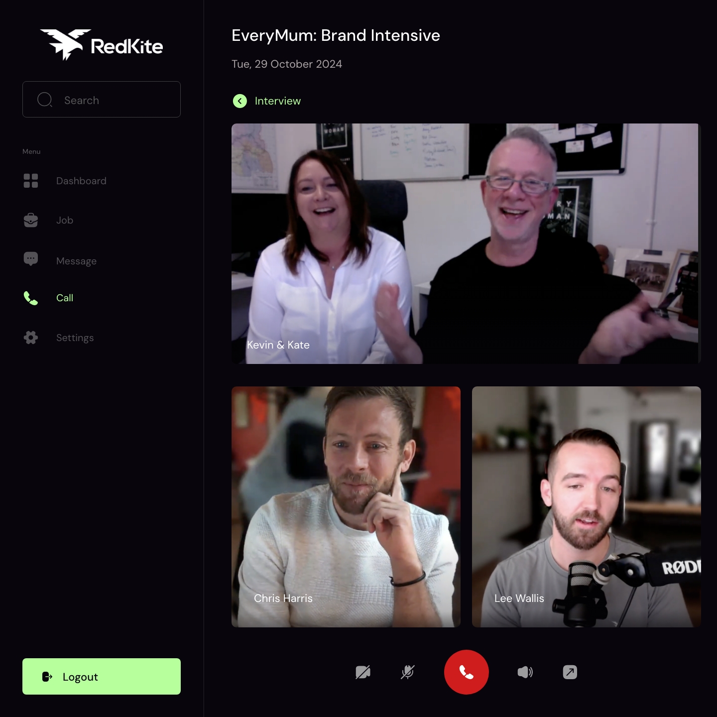
Catching up for a Brand Intensive with the EveryMum founders
Our brand process always starts with listening—and for EveryMum, that meant diving deep into their story, mission, and hopes for the future. In our Brand Intensive session, we unpacked everything from their volunteer roots and global aspirations to the pain points in maternal healthcare they’re working to solve.
What we found was an organisation powered by empathy, driven by experience, and ready to raise its voice. Kate and Kevin’s personal journey—from a floating medical clinic in Cambodia to a bold vision for global impact—brought clarity to our creative direction. This wasn’t about looking more ‘polished’; it was about capturing authenticity, compassion, and momentum in a way that could unite people around the cause. That clarity laid the foundation for everything that followed—from the name to the narrative.
What we covered
Origin story
Founder motivations
Key differentiators
Challenges in the sector
Target audiences
Marketing strategy
Future aspirations
Brand personality
Design requirements
& more
The name & logo: the first pieces of the puzzle
A name that connects. A logo that carries meaning.
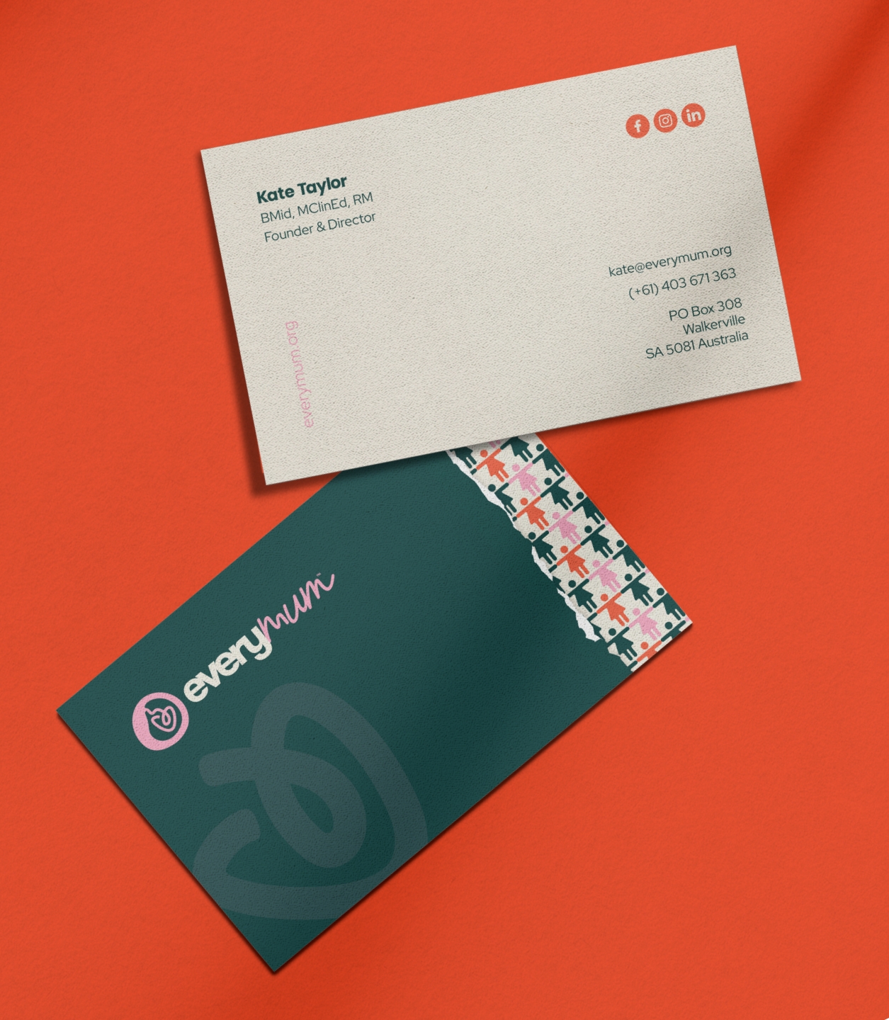
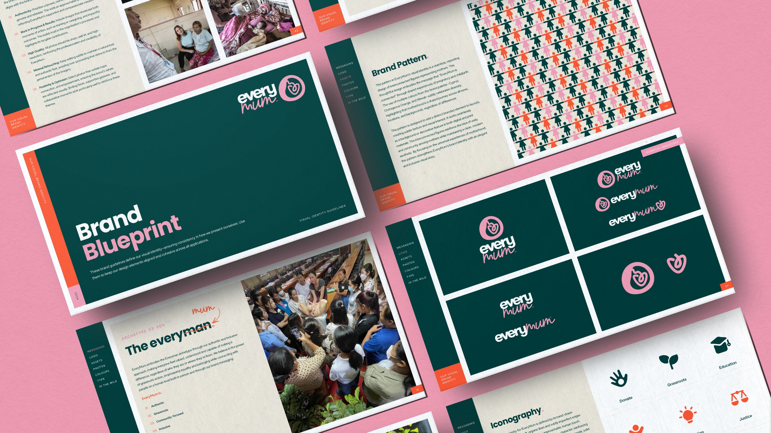
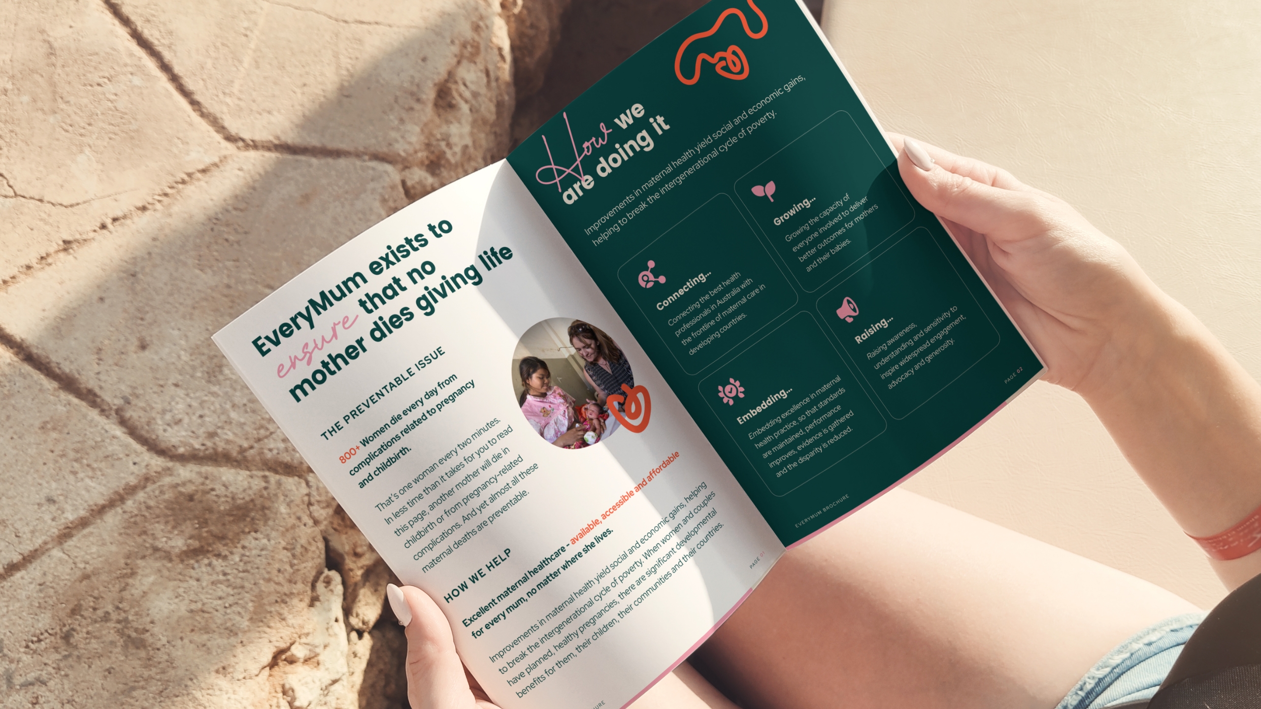
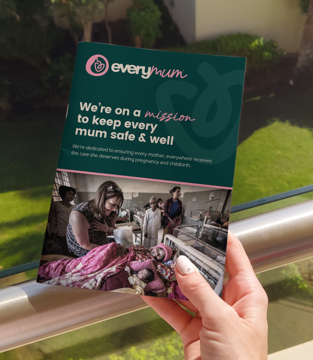
The EveryMum logo needed to do a lot of heavy lifting. Not only did it have to feel trustworthy, warm and professional—it also had to carry deep symbolism without relying on clichéd visuals. The final icon represents a mother’s belly with an embracing baby shaped like a heart, subtly wrapped in an umbilical cord—speaking to connection, life, and care in a simple, elegant way.
The name itself, EveryMum, captures the heart of the mission: that no matter where she lives, every mother deserves the best possible care. It’s inclusive, emotive, and instantly relatable—setting the tone for the visual identity that follows.
But as always, the logo is just the beginning. With this foundation in place, we expanded the identity into a full brand system designed to connect, inspire and advocate—across borders, communities and touchpoints.
Building the brand beyond the logo
Assets designed for speed, clarity, and impact
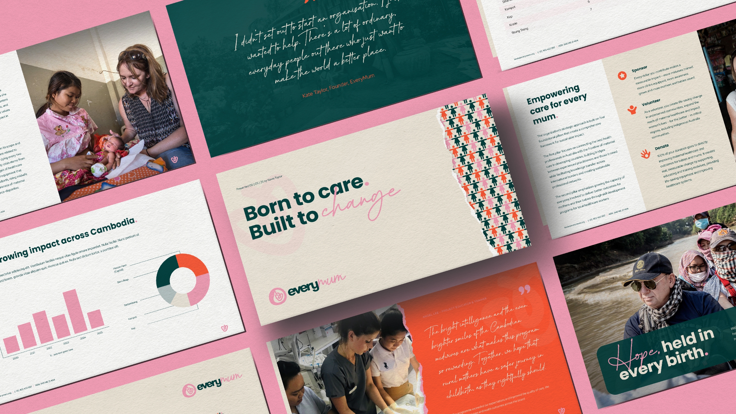
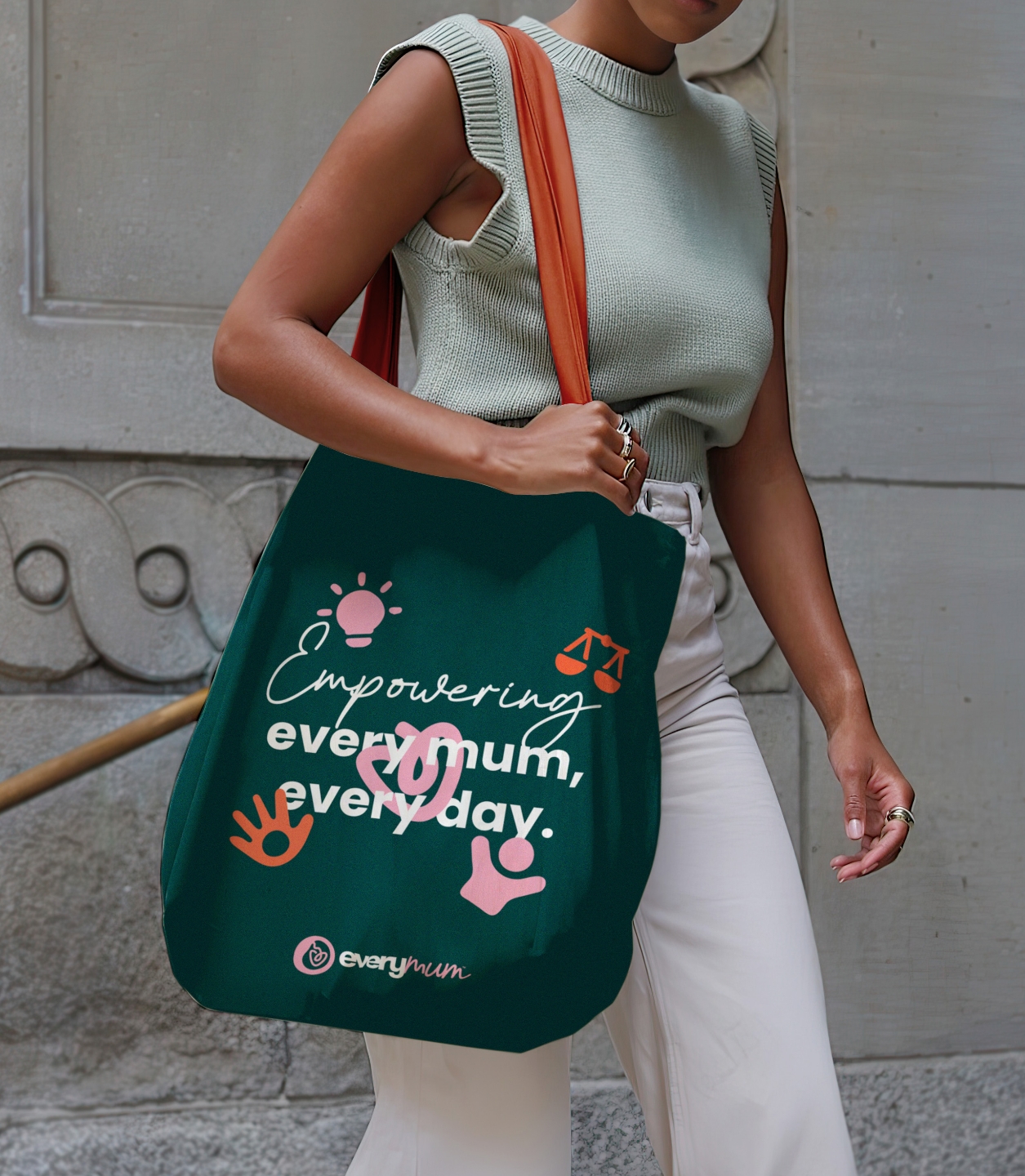
A logo is never the full story. For EveryMum, we built a brand identity system that speaks from the heart while scaling across continents. The assets we created were designed to feel warm, human, and unifying—elements that could stand tall at on a global stage or carry weight in a local campaign.
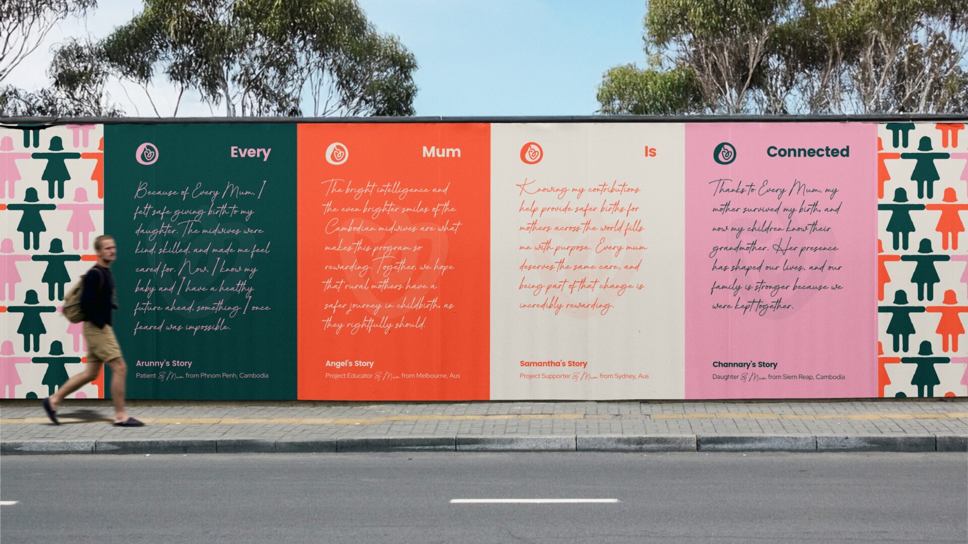
We developed soft, organic shapes to mirror the curves of the logo, hand-drawn iconography to keep things grounded and grassroots, and a bold yet nurturing palette to balance compassion with credibility. The “Mothers Worldwide” illustration and signature brand pattern add extra layers of meaning—visually reinforcing the shared experiences of mums around the world. It’s a brand that doesn’t just look the part—it feels it.
Brand assets created
Custom icon set
Brand shapes
‘Mothers’ graphics & illustrations
Brand patterns
Photography treatments
Typography treatments
Language that connects, empowers & inspires
Messaging that speaks to hearts, minds & shared humanity
EveryMum’s message isn’t just for one type of person—it’s for anyone who believes that no woman should die giving life. That’s why we created a messaging system that could resonate with donors, volunteers, healthcare professionals and everyday families alike—uniting them behind a single, powerful mission.
From their positioning statement to taglines, campaign slogans and tone of voice principles, we shaped a verbal identity that’s warm, compelling and deeply human. It speaks with empathy and clarity—giving voice to the women and communities EveryMum supports, while inspiring others to take action.
The result is a brand voice that’s not only aligned with their visual identity—it’s driven by real stories, grounded in care, and ready to bring people together in support of a truly life-saving cause.
What was included
Brand story
Purpose, vision & mission
Values
Archetype & personality
Voice
Attributes
Vocab
Key messages
Difference
Positioning
Taglines & slogans
& more
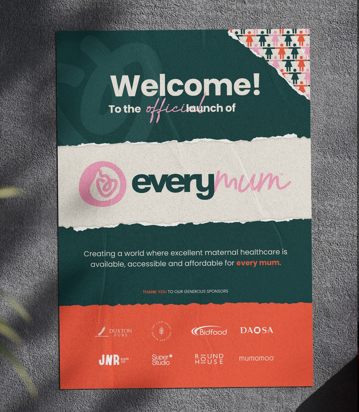
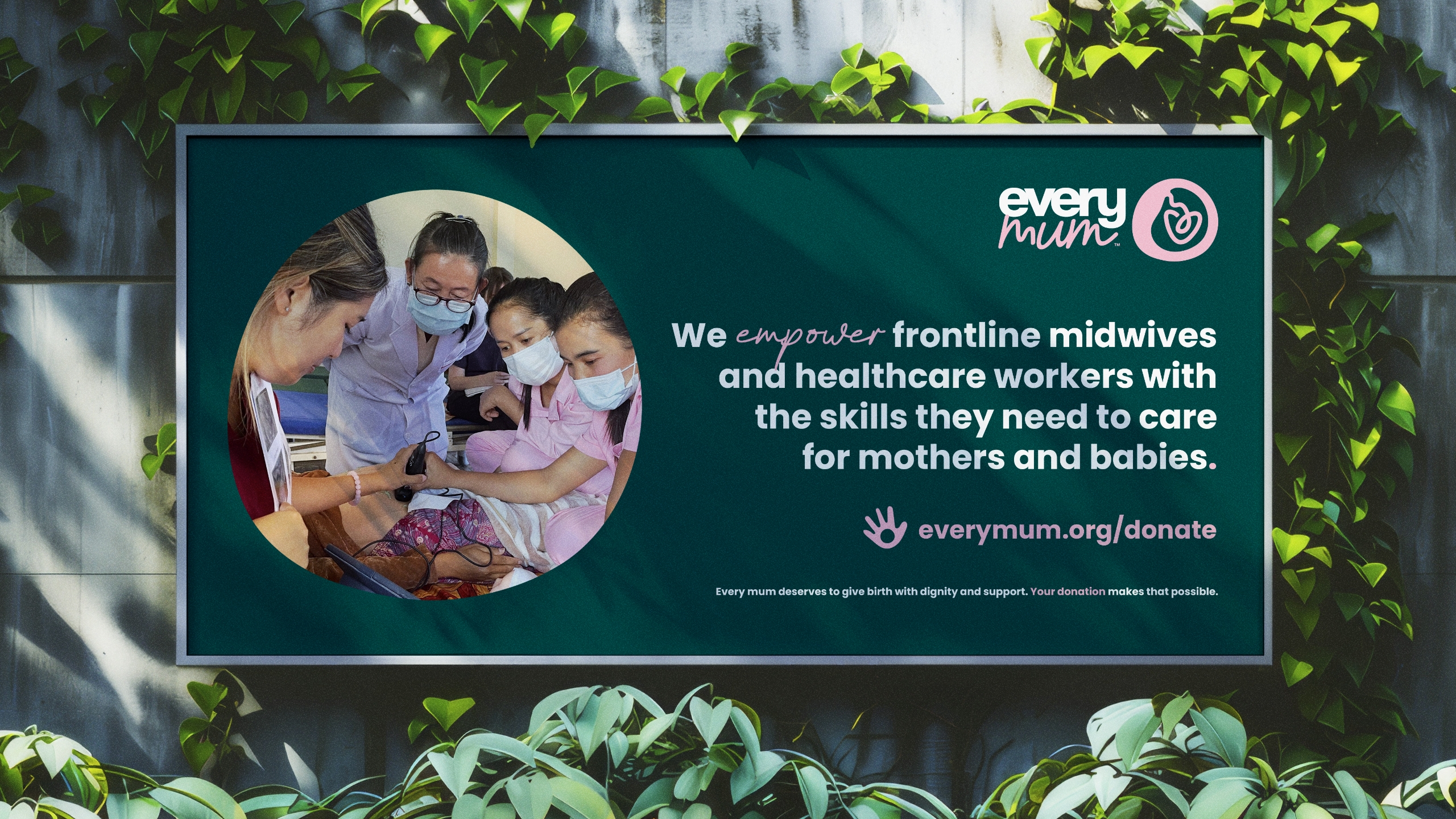
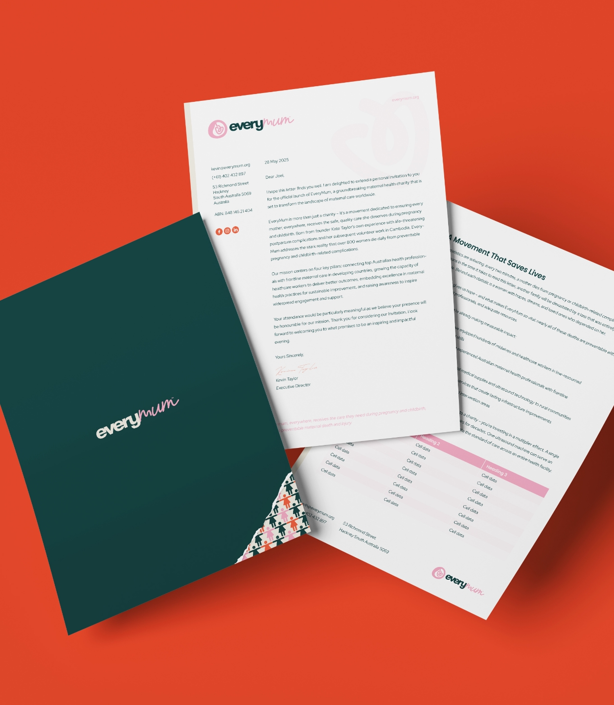
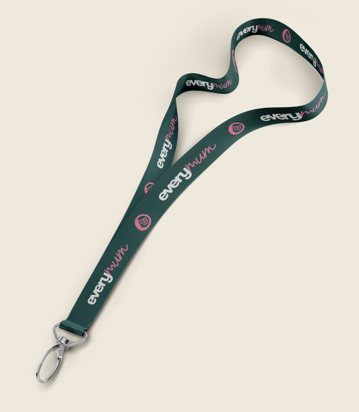
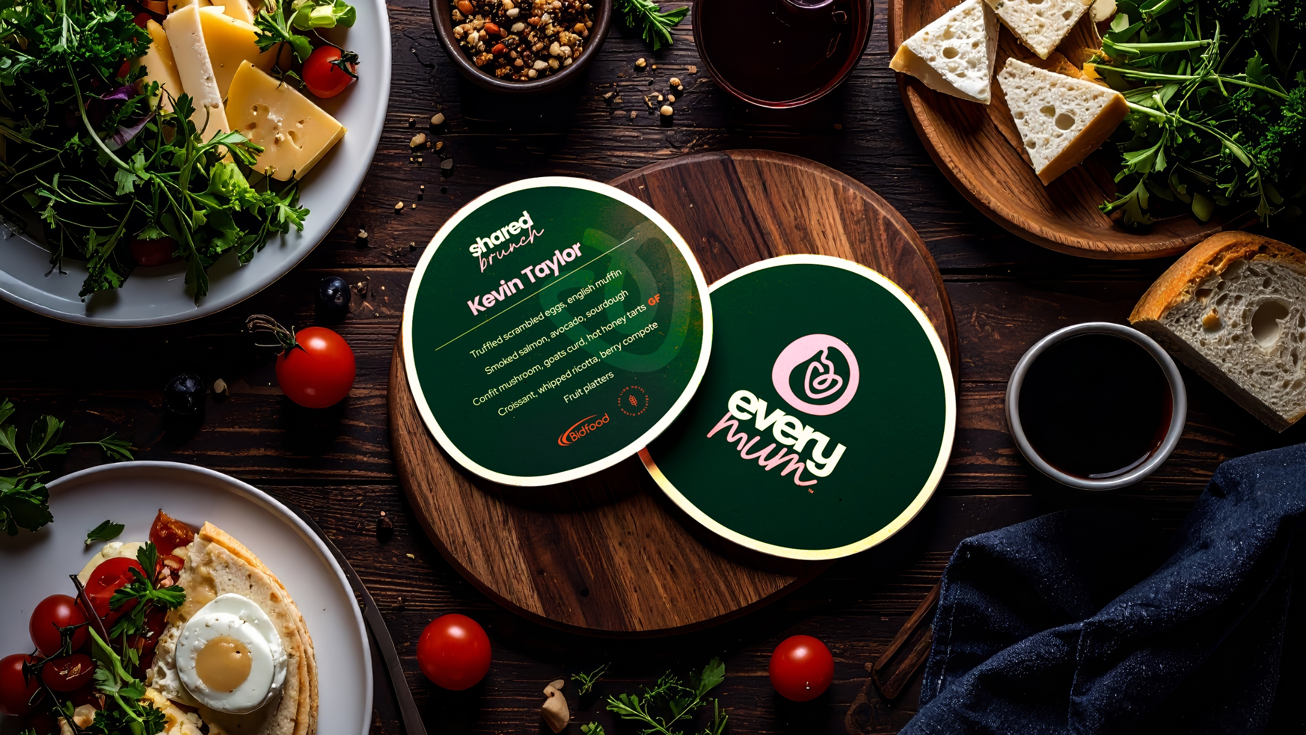
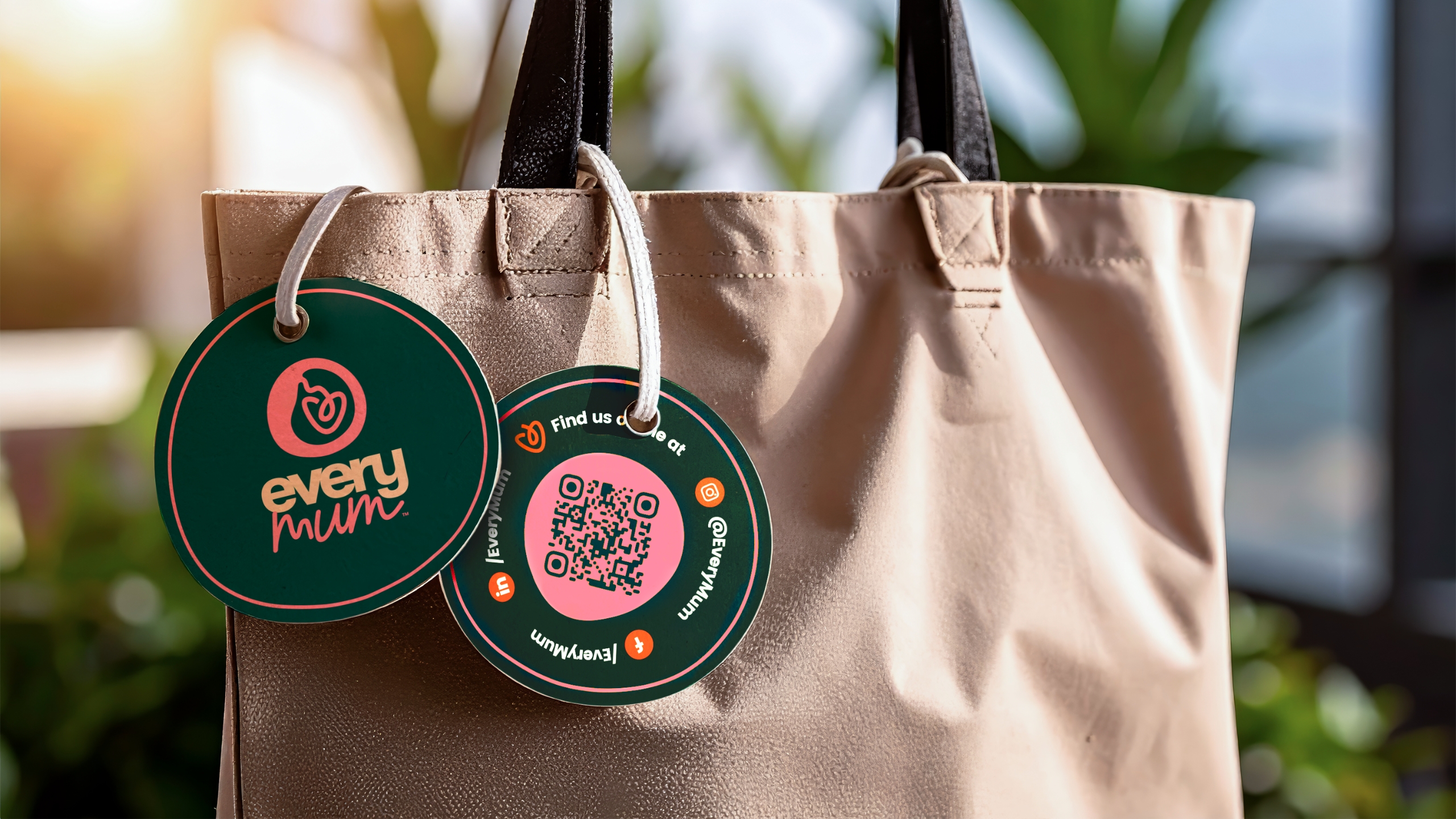
Printed Marketing Collateral
Touchpoints that tell the story
Bringing the brand to life, everywhere it matters
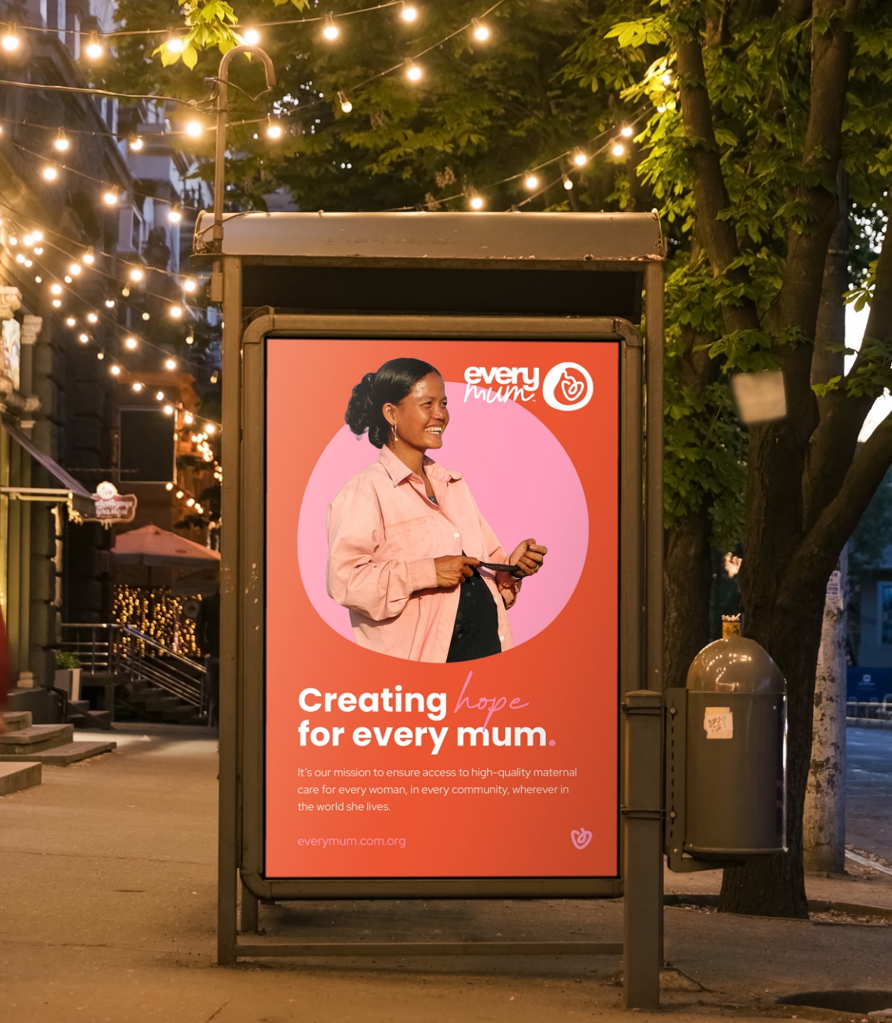
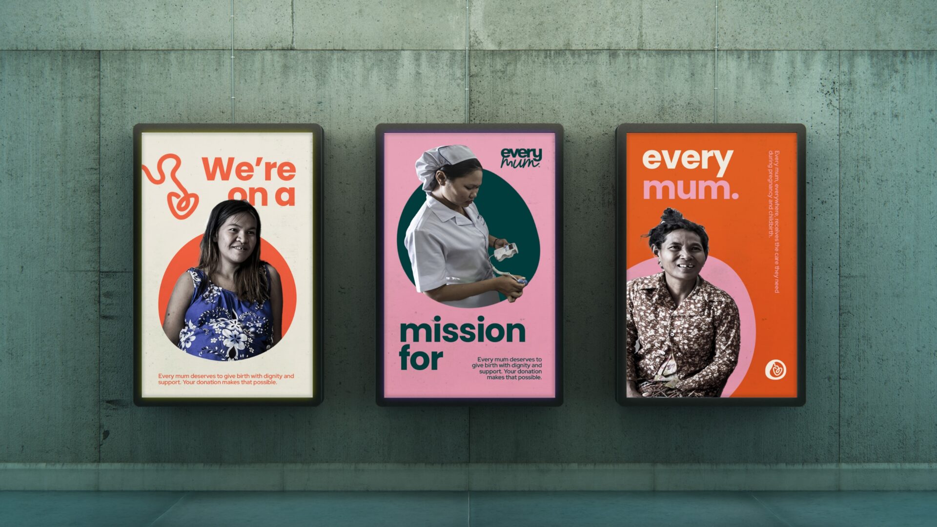
With the foundations in place, we set out to make sure EveryMum’s identity could show up clearly and meaningfully across every touchpoint. Just dropping the logo on everything wasn’t going to have the impact they needed—this rollout had to be intentional, emotionally resonant, and built for connection.
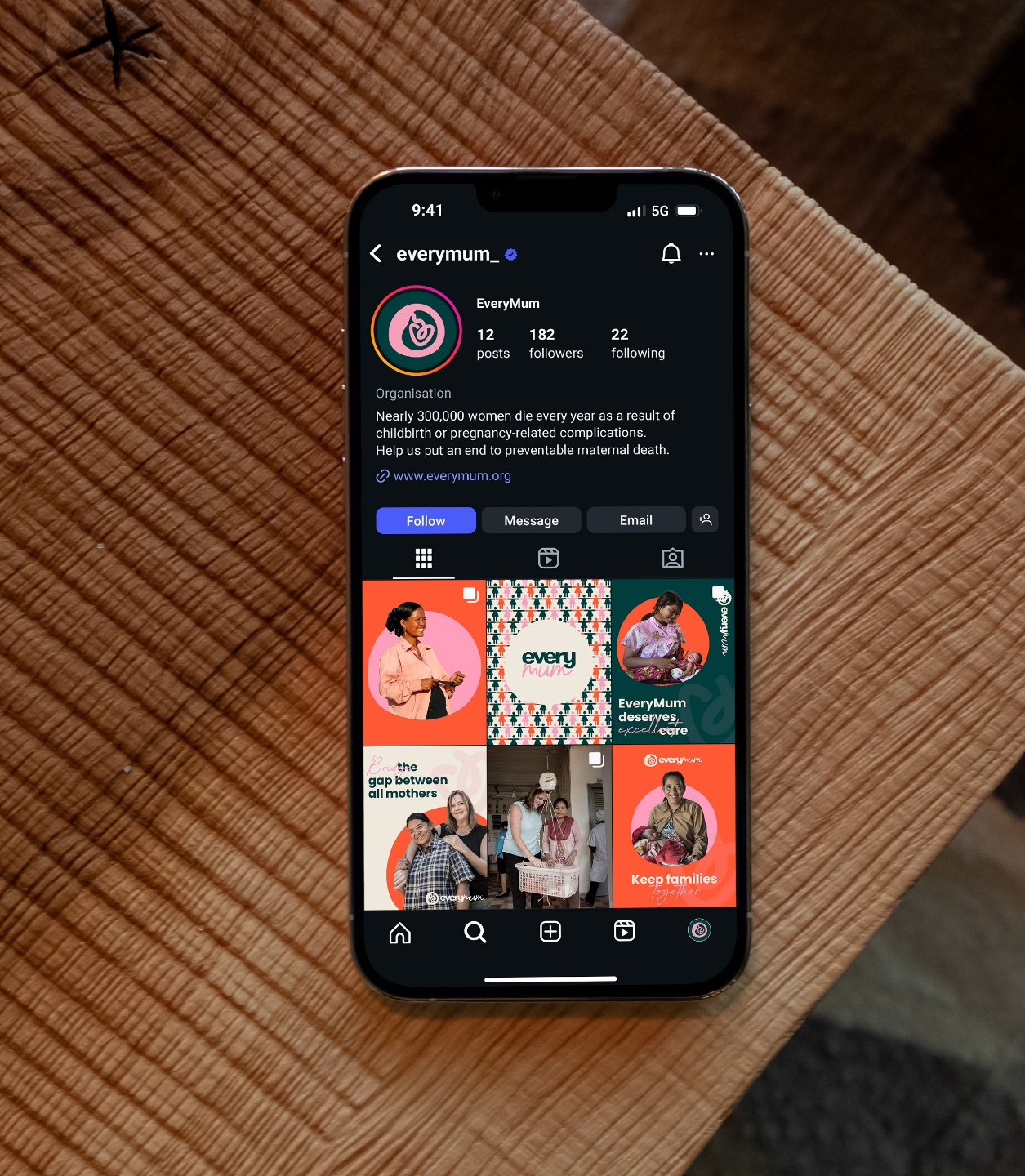
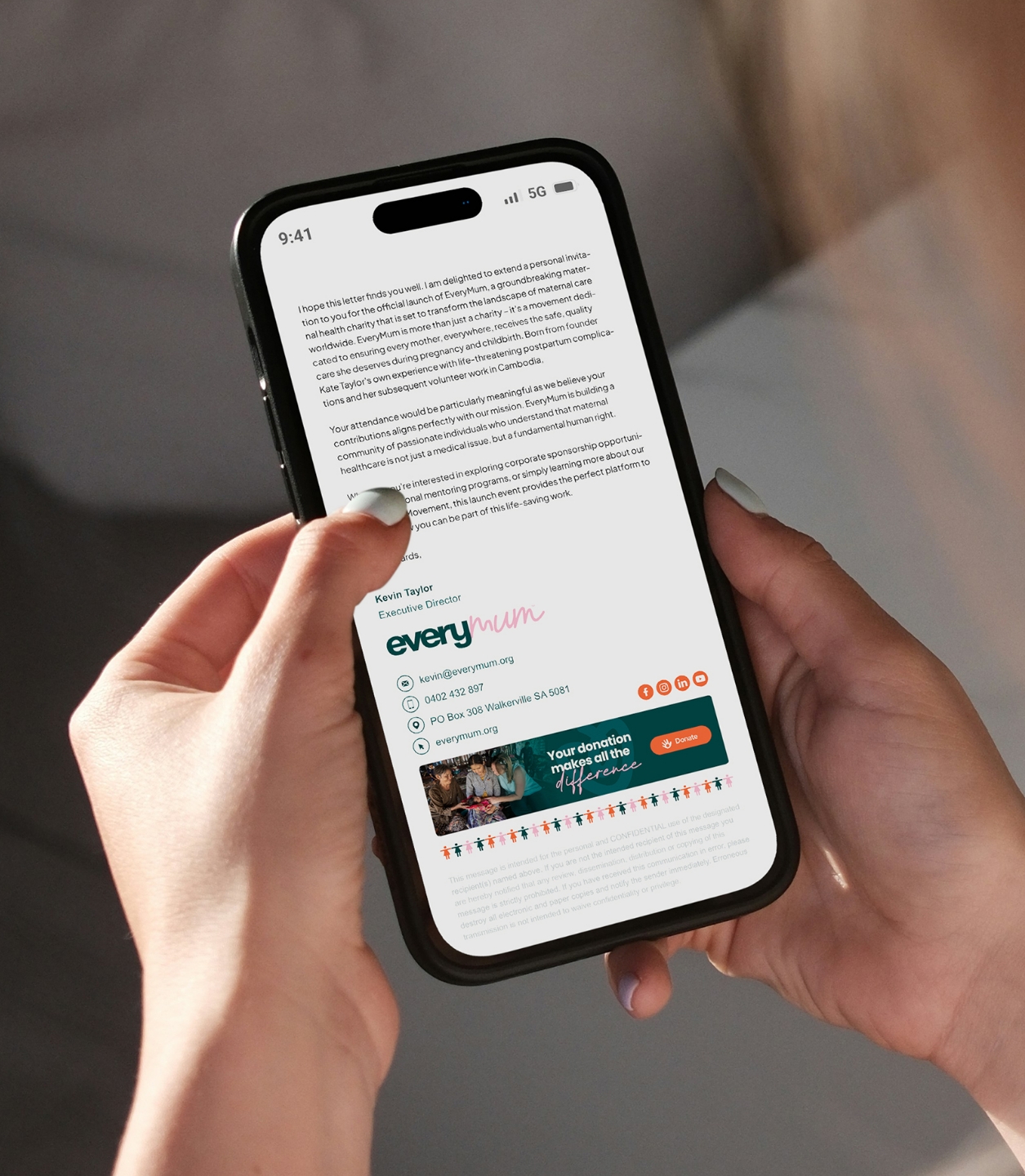
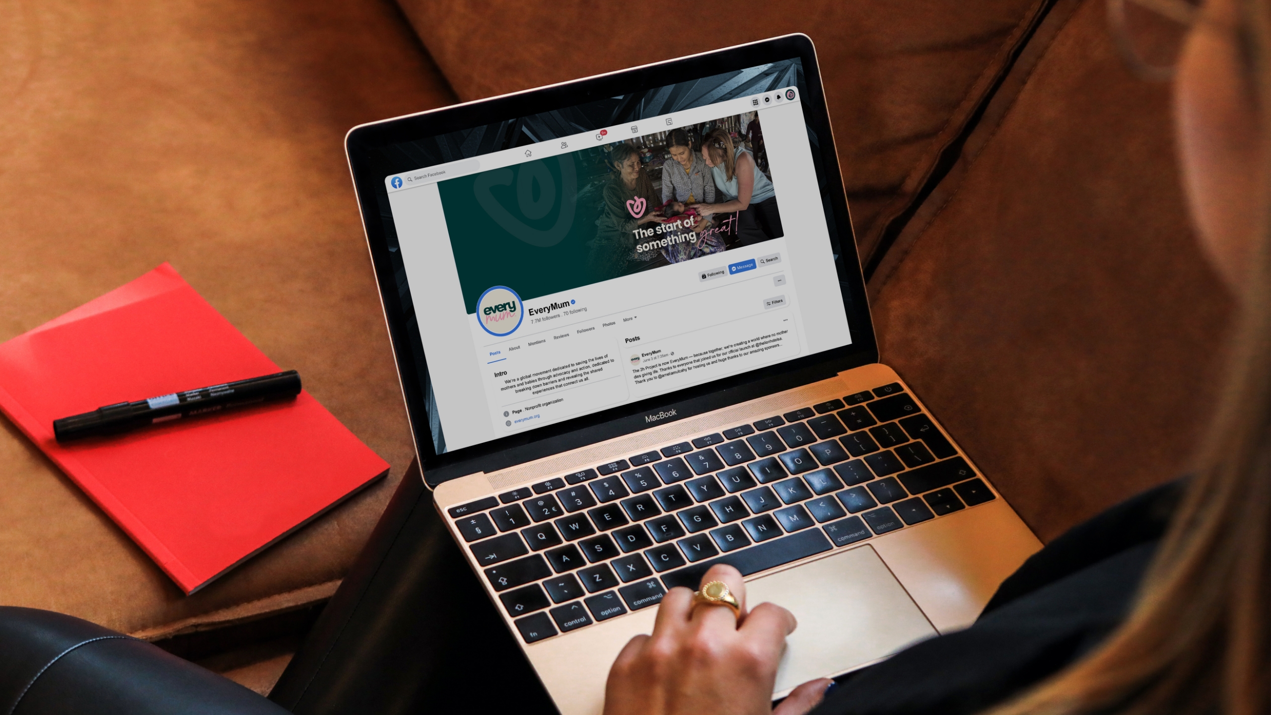
From printed materials and volunteer kits to digital templates and launch campaigns, the brand was rolled out with care. Each piece—whether a flyer, email, social post or presentation—was crafted to carry the same compassion and credibility at the core of the organisation. The result? A cohesive and flexible suite of tools that equips EveryMum to tell their story, engage supporters, and amplify their mission—wherever it’s seen.
Brand collateral crafted
Corporate stationery
Social media kit
Social media post designs
Brand launch materials
Website design
Email marketing materials
Promotional & marketing collateral
& more
Social Profile Page Designs
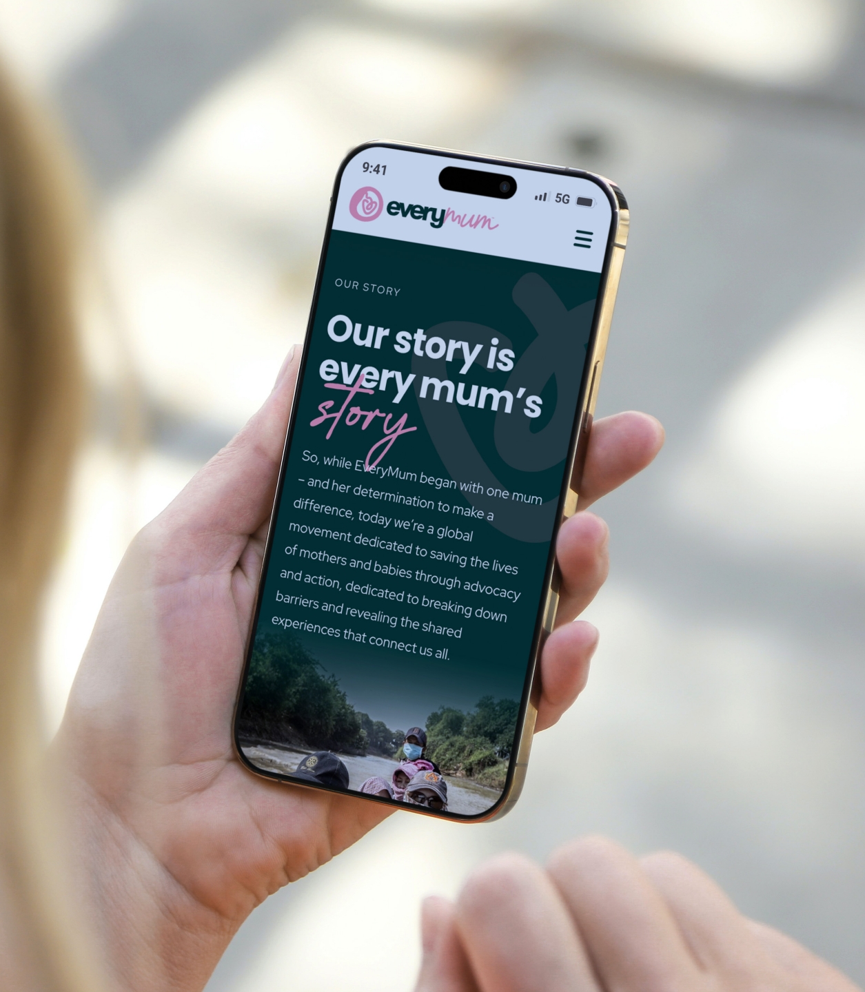
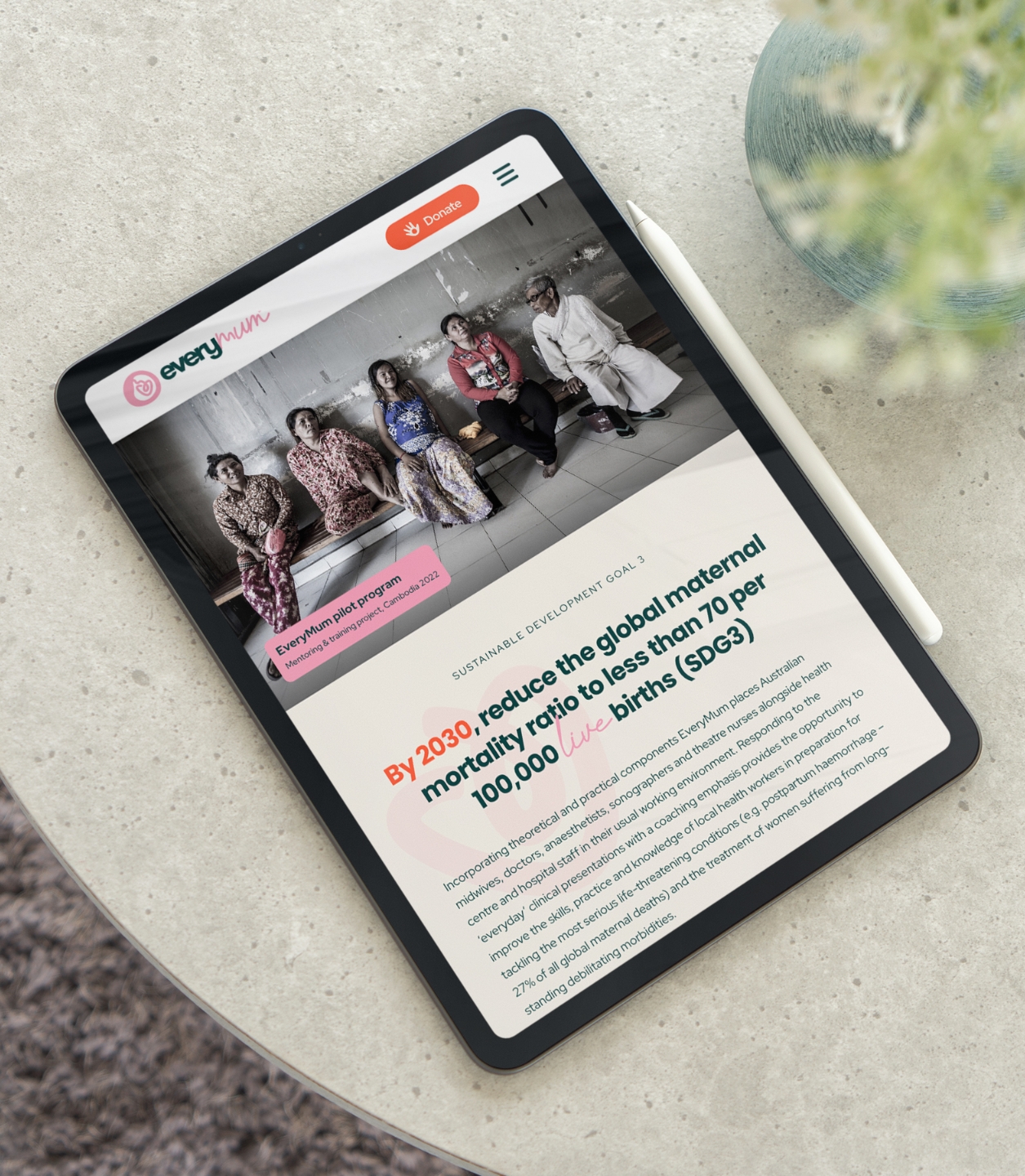
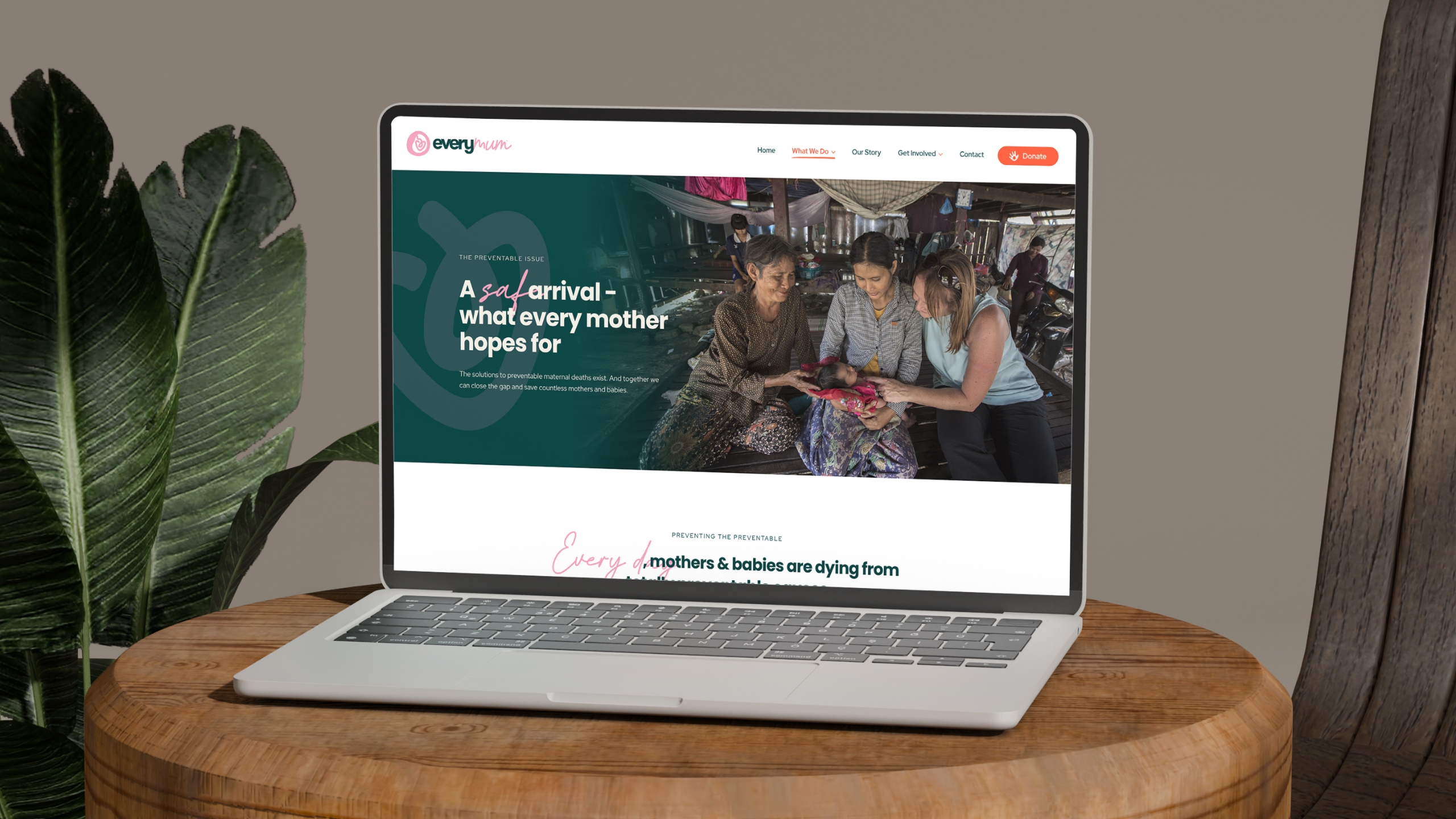
A website to carry a cause
A digital home for a global movement
The EveryMum website needed to do more than just look good—it had to be intuitive, trustworthy, and ready to grow with the organisation. We designed and developed a custom-built site that brings their mission to life through purposeful storytelling, thoughtful structure, and clear calls to action.
Built with a mobile-first approach and optimised for donations and engagement, the site guides users through EveryMum’s story, their impact, and how to get involved. Design-wise, we wove in soft curves, layered textures and dynamic visuals to mirror the emotional tone of the brand. From education to advocacy, EveryMum now has a platform that reflects their professionalism and compassion in equal measure.
From concept to creation
Market research
Strategy & wireframing
Professional copywriting
Bespoke design
Ecommerce
Post-launch analysis
Responsive Website Design
“Working with Chris, Lee and Ally and the entire team at Red Kite Design was a genuinely positive and rewarding experience! From our very first conversations, they took the time to really listen—understanding our story and the unique experiences that shape our work. That level of care and attention meant a lot to us.
The best part? Not only did we end up with a fantastic final product, but Red Kite also helped us understand how to make the most of the tools they delivered. We feel incredibly fortunate to have such a thoughtful and skilled team in our corner. Highly recommended!”

 EveryMum